
Sixty-four people on one map sounds like chaos. In the best Battlefield maps it reads as legible combat with a shape you can follow, and in the worst it reads as a long walk interrupted by a sniper you never saw.
The difference is not the number. It is what the map does with it, and the series has spent two decades relearning that lesson at intervals.
The Metric That Actually Matters
Here is the mistake that produced the most criticised entry in the franchise.
Player count and player density are different things. Doubling the number of players on a map twice the size leaves density unchanged. Doubling them on the same map halves the distance between encounters. Only the second one changes how the game feels.
What players experience is not headcount but time-to-contact: how long after spawning before you are in a fight. Under about fifteen seconds and the map feels alive. Push past forty and it feels empty regardless of how many people are technically present, because the ones who are present are somewhere else entirely.
That is why a 128-player map can feel emptier than a 64-player one, which sounds like a contradiction until you do the arithmetic on usable square metres per contested objective.
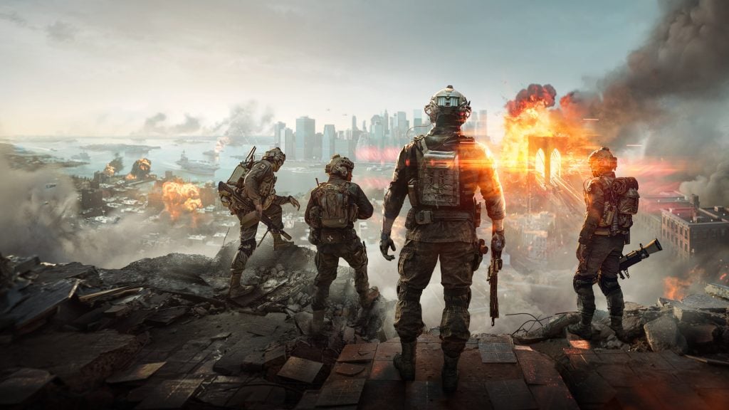
Whether the current entry gets that balance right is the central question for anyone reviewing it, and the Battlefield 6 review on God is a Geek is worth reading on exactly that point, because map feel is the thing screenshots cannot convey and specifications cannot predict.
It is also why multiplayer shooter reviews diverge more than single-player ones. Two reviewers playing the same map in different lobbies are, in a real sense, playing different games.
Flags Are the Funnel
Conquest is the mode the series is built around, and its objectives do almost all the work of organising a match.
A capture point is a magnet. It tells every player where to go, which means the designer chooses where fights happen by choosing where to place them. Spacing determines density directly: cluster them and you get sustained contact, spread them and you get travel time.
The best maps in the series understand that the spacing between objectives is the real difficulty setting. Golmud Railway and Caspian Border work because the distances are long enough to justify vehicles and short enough that infantry can cross them without the journey becoming the experience.
The second thing flags do is create front lines. A well-designed Conquest layout produces a contested middle that moves back and forth, which is what makes a match feel like a battle rather than a series of unrelated skirmishes. Layouts with objectives scattered evenly across open ground produce the opposite: every point contested by three people, nothing that reads as a line.
Metro and Caspian Are the Two Answers
The series has never resolved the argument between its two design philosophies, and both have produced classics.
Operation Metro is essentially a corridor. Three lanes, brutal chokepoints, almost no vehicles, and a middle section that becomes a grinder. People either love it or consider it the worst map ever shipped, and both positions are defensible.
What Metro guarantees is contact. You will find a fight within seconds of spawning, every time, without exception. The cost is that tactical options collapse to pushing forward or not pushing forward.
Caspian Border is the other answer. Open terrain, meaningful air and ground vehicles, long sightlines broken by a few key structures, and enough space that flanking is a real option rather than a theoretical one. It rewards coordination in a way Metro never does.
The cost is that a disorganised team produces exactly the emptiness described above. Caspian works when the lobby is engaged and falls apart when it is not, which is a genuine design risk rather than a flaw.
Most memorable maps in the series sit near one pole or the other. The forgettable ones sit in the middle.
Sightlines Decide Whether Vehicles Matter
The third variable, and the one that gets tuned most often after launch.
Open ground with long clear sightlines makes armour dominant and infantry disposable. Dense cover everywhere makes vehicles into slow targets with no role. Neither produces good combined arms, which is supposedly the thing the series exists to deliver.
The maps that solve it use elevation and hard cover to create lanes vehicles can use and pockets infantry can hold. A tank that can dominate an approach but cannot enter a compound is a threat rather than a win condition, and that distinction is almost entirely a function of where the designer put the walls.
It is also why post-launch map reworks in this series overwhelmingly involve adding cover rather than removing it. The failure mode is nearly always too open.
What 2042 Demonstrated
The most instructive entry is the one most people would rather forget, because it isolated the variable cleanly.
Battlefield 2042 paired bigger player counts with proportionally bigger maps, and produced longer traversal, fewer encounters per minute, and vast stretches of terrain with nothing in them. The subsequent reworks shortened distances, added cover and restructured objectives, which is a fairly direct admission that the original spacing was the problem rather than the technology.
That is a genuinely useful data point for anyone interested in multiplayer design. The constraint on large-scale combat is not the server, the netcode or the hardware. It is that human attention needs encounters at a certain rate, and no amount of scale substitutes for that.
The Version Worth Playing
The maps that last in this series share three properties, and none of them concern player count.
Objectives close enough to guarantee contact. Fifteen to twenty seconds from spawn to a fight, reliably.
A contested middle that moves. Front lines make a match legible. Scattered points do not.
Cover that gives vehicles a role without giving them the map. Lanes and pockets, not open ground or endless buildings.
Get those right and sixty-four people feel like a battle. Get them wrong and the same sixty-four feel like a commute with occasional gunfire, which is the specific failure the franchise has now committed and corrected more than once.

Hi! I’m Bryan, and I’m a passionate & expert writer with more than five years of experience. I have written about various topics such as product descriptions, travel, cryptocurrencies, and online gaming in my writing journey.