
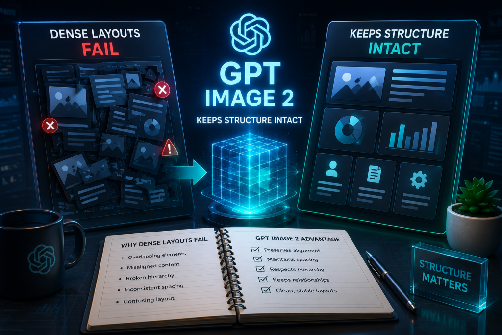
Style is the easy part of AI image work. Structure is what kills the week. An infographic that looks cinematic but scatters labels, a UI mockup that invents extra buttons, a sports poster that loses the match block — those frames cannot ship, no matter how dramatic the lighting. Gpt image 2 is interesting for desks that live in high-density layouts because the public claim is not “prettier pixels.” It is structured composition: maps, infographics, product UI, and event posters that keep blocks readable in one frame.
This piece treats density as the pass/fail. If a layout collapses into decorative mush under a multi-part brief, the model failed the job. If the hierarchy of regions, labels, and modules still holds beside the brief, the platform clearly earns another paid iteration. The earlier poster-text conversation is adjacent, not identical — here the question is block structure across the whole page, not a single headline alone. Keep that distinction written on the brief so the review does not slide back into taste theater.

Pretty Frames Collapse When Layout Blocks Drift
Watch a campaign desk build a one-page explainer. The brief asks for a title zone, three data callouts, a small map, and a footer source line. A soft model returns a lush illustration with floating numbers that do not align to any region. The team wastes an afternoon arguing about color while the real miss is structural: nobody can point to where each claim lives.
The soft miss is easy to catch if you force a region checklist. If a callout drifts into the map, or a button row invents a fourth control the product does not have, that frame is a discard before client review. Pop-culture and sports desks see the same failure on posters that need match details and branding in fixed slots — atmosphere without slots is not a shippable deliverable for a real campaign.
Count the cost in rework, not in vibes. A frame that needs three full remakes because hierarchy never locked is more expensive than a quieter draft that kept every region attached on the first refine. On a busy entertainment or product desk, that rework shows up as missed handoff windows and a shared drive full of “almost” files nobody can defend.
Force the discard rule early. If the inventory is incomplete, the frame never enters the style review channel. That single discard saves the meeting where people argue gradients over missing modules.
What High-Density Work Actually Demands
Dense work is not “more objects.” It is constrained regions that must survive together: hierarchy, alignment, and labels that stay attached to the right panel. Chatimages positions GPT Image 2 for exactly those jobs in its public use cases — sports match posters with structured information, map and infographic generation, and product UI / app design mockups from a single prompt. That list is the product evidence for this thesis; it is not an invitation to chase every style filter on the homepage.
| Layout job | Structure that must survive | Hard fail signal |
| Infographic / map | Regions + labels + legend | Labels float off their regions |
| Product UI mockup | Nav, modules, primary actions | Invented controls or missing core screens |
| Event / sports poster | Hero + match block + branding | Details melt into atmosphere |

Use the table as a keep/kill sheet. Style debate starts only after every required block is present and attached. If your brief cannot fill the left column, you are not running a density test — you are running a mood test.
World-knowledge claims matter here for a practical reason. Maps, periodic-table style charts, and brand-accurate product shells break when the model guesses structure. The platform’s public pitch for real-world visual knowledge is useful only if your checklist includes those factual blocks, not if you only ask for “epic lighting.” Clean color reproduction claims matter the same way for brand managers: a beautiful cast that warps product color is still a commercial miss.
Write a one-line owner for each region before you generate. If nobody owns the footer source line, it will vanish and someone will call that “minimalism.”
How The Chat Loop Protects Hierarchy During Refines
On the site, the editing loop is conversational: upload or start from text, describe the edit in plain English, generate, then refine with follow-ups before downloading PNG or WebP. For density tests, that loop matters because you can ask for one missing block without remaking the entire mood from scratch — provided the model actually preserves the rest of the hierarchy.
Lock Regions In The Opening Brief
Write the regions as inventory, not vibes. Example shape: title top; three equal callouts; map left; source footer. Name what must not invent itself. Gpt image generations that ignore that inventory will still look “AI impressive” and still fail a publish checklist. GPT Image 2’s published strength on high-density layouts is the claim under test — not a promise that sloppy briefs suddenly become structured.
Put the inventory above the style words on purpose every single time. If “cinematic” appears before “three callouts,” the model will optimize for atmosphere and you will pretend the missing legend is a taste issue.
Iterate One Missing Block At A Time
When a draft returns, compare it to the inventory list, not to a mood board. If the map is strong but callouts drifted, ask only for callout repair. If the UI invents a tab, delete that version and tighten the exclusion line. In my testing protocol, a frame that needs a full scene rewrite after every small miss is a density fail even if one crop looks fine in isolation.
Observable checks that keep the protocol honest:
-
Every named region is present without merging into a neighbor.
-
No invented control, badge, or match detail appears.
-
A follow-up edit that fixes one block does not scramble the others.
-
The download is judged against the inventory before anyone debates style adjectives.
The platform also hosts Nano Banana 2 and other models under one subscription. For this thesis, keep the first ladder on GPT Image 2 for structured layouts. Switch models only after you can name which structural fail you are trying to fix — not because a different logo feels fresher. Chatimages is useful here as the shared account that keeps that comparison inside one workspace instead of five logins.

Keep Structure Scores Ahead Of Style Arguments
If your briefs are single-subject beauty shots, density tooling is optional. If your week is maps, UI shells, and information-heavy posters, judge Chatimages on whether GPT Image 2 keeps blocks attached after a chat refine. Run one fixed inventory brief, score regions before taste, and discard frames that invent modules. Expand into video models only after still layouts stop collapsing under ordinary multi-part briefs in a normal production week with real client deadlines attached tightly.
Write the region checklist on the brief itself. The desk that argues style before structure will keep shipping atmosphere and calling it a layout. The desk that scores structure first will know whether the model earned the next credit spend, and whether Chatimages is actually changing the denser jobs on the calendar.

Madeline Miller love to writes articles about gaming, coding, and pop culture.