
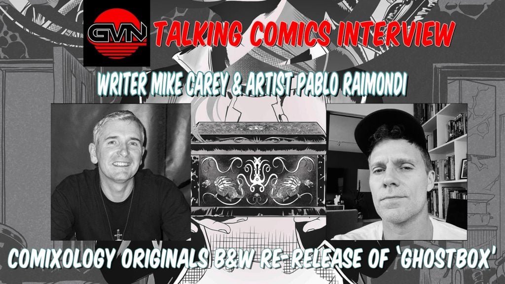
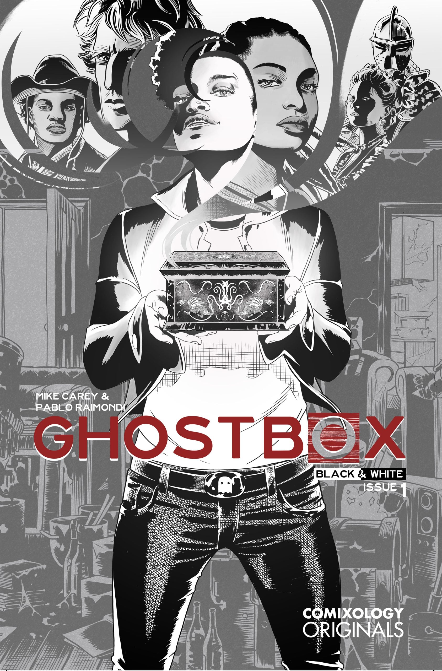
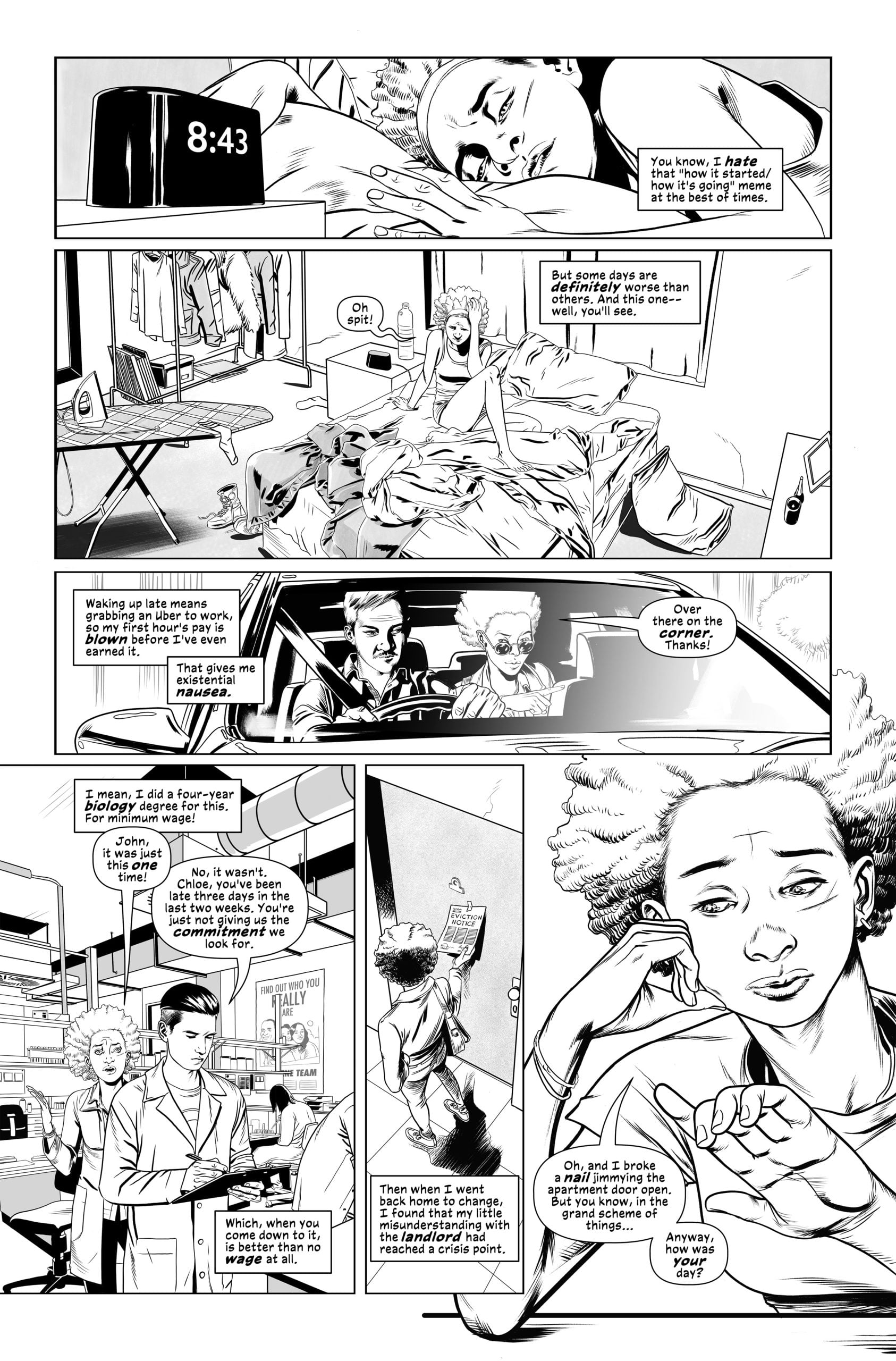
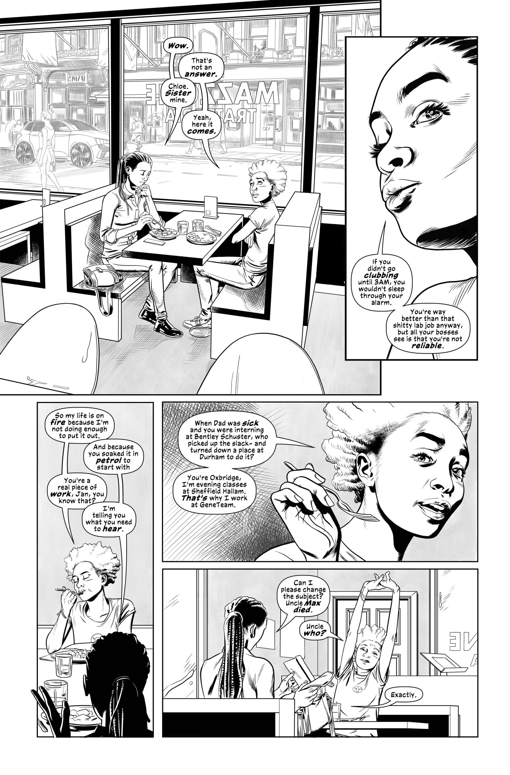
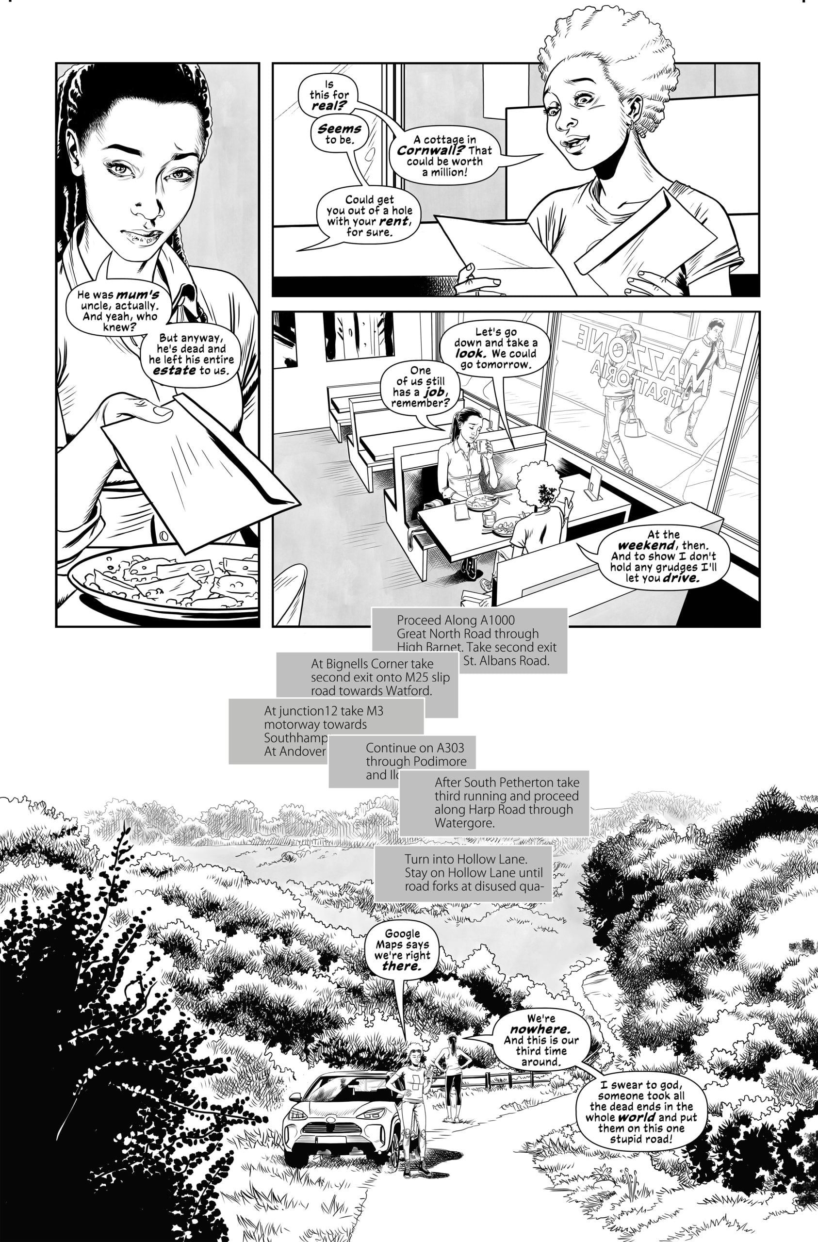
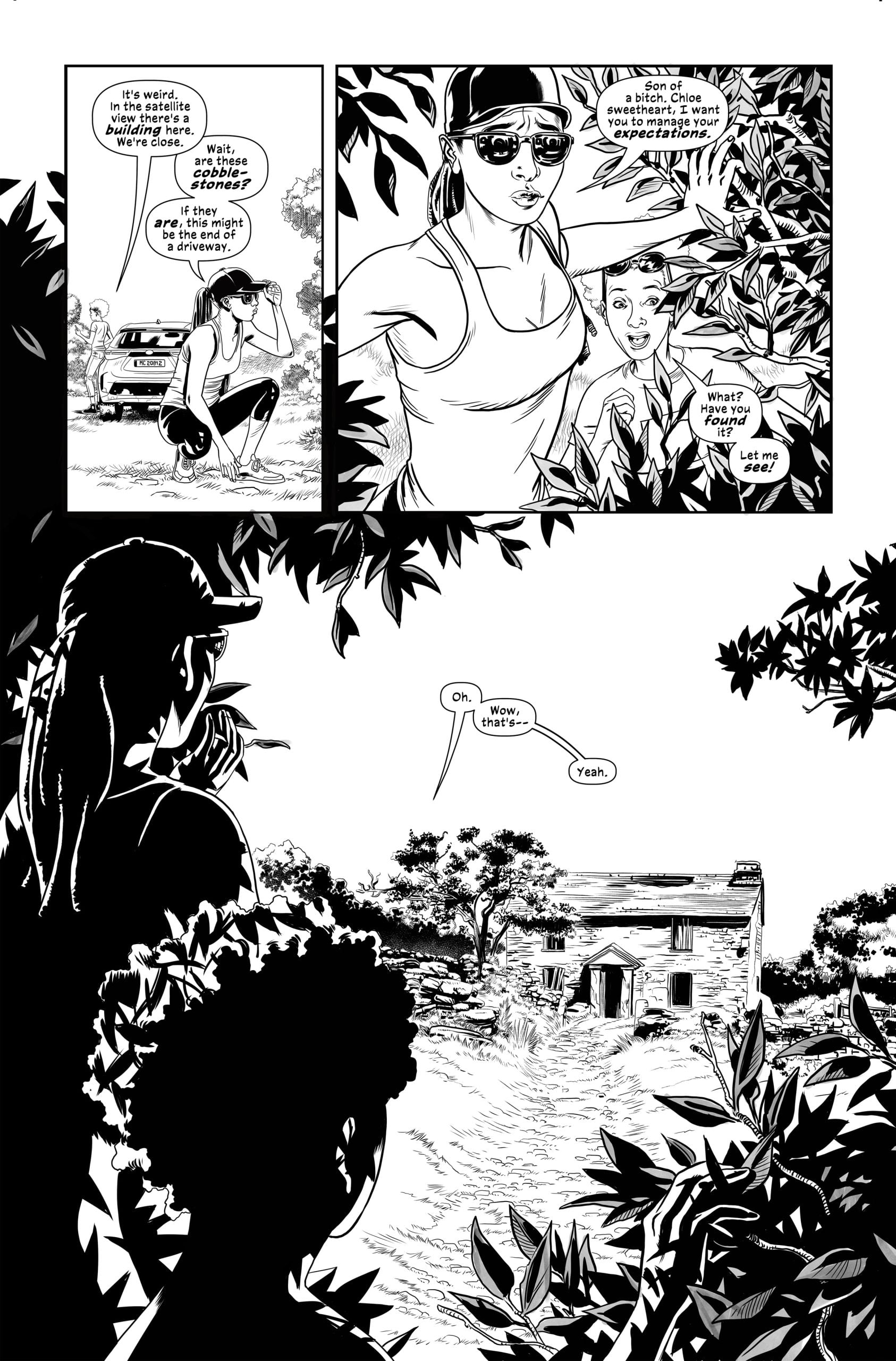
Originally released as a genre‑bending blend of noir, metaphysics, and sci‑fi, Ghostbox has always been one of those books that rewards a second look. Now, writer Mike Carey and artist Pablo Raimondi offer readers a new black-and-white edition through Comixology Originals, which strips the series down to its most fundamental elements. Without color, the story’s shadows, textures, and psychological edges take on a sharper, more intimate feel — revealing just how much of Ghostbox was built in the interplay between Carey’s layered scripting and Raimondi’s meticulous linework.
Recently, we caught up with Mike and Pablo to talk about revisiting the world they created, what the monochrome format brings to the surface, and how it feels to reintroduce Ghostbox to both longtime fans and first‑time readers. We kicked things off with writer Mike Carey.
Writer Mike Carey
GVN: Thank you for visiting with us, Mike. Since this is our first visit, let’s start with your creative beginnings. When did you take an interest in writing and, for comics specifically, whose work inspired that desire?
MIKE: It’s really hard to point to a particular moment and say that’s where it started. Telling stories was just something that I always did and was always drawn to. In school whenever we were set a creative writing assignment I’d turn it into something long and sprawling, a shapeless mini epic that was probably impossible for the teachers to mark. I used to steal exercise books from school and fill them with stories they were always pastiches of whatever I was reading at the time.
As for comics, they had been in my life since the age of three. There was a British comic called WHAM, which feature the work of two really great artists, Ken Reed and Leo Baxendale. Footsie the Clown, Georgie’s Germs, Eagle Eye the Junior Spy, I couldn’t get enough of that stuff. They were mostly just one page gag strips but beautifully done. Then I discovered American comics where my older brother gave me a Fantastic Four annual to make me go away. It was FF Annual#6 – Stan and Jack – and there was no looking back.
I actually gave up reading comics briefly in my teens, but the Chris Claremont X-Men run drew me back in. Then after I left college I started writing reviews and articles for fanzines, and from there it was a fairly short jump to submitting pitch ideas to UK editors. Although it took me another ten years after that to get anything in print.
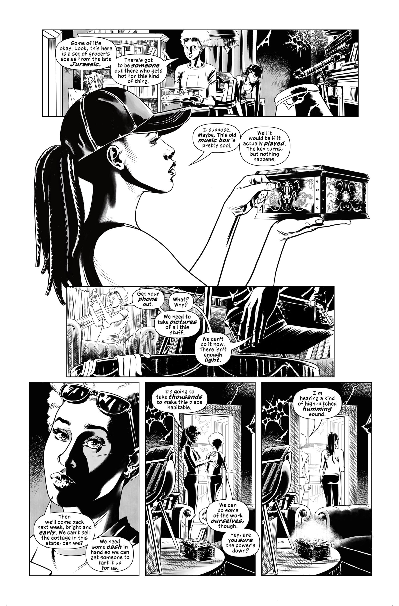
Black-and-White Ghostbox
GVN: So, let’s open up this new look into the “Ghostbox.” When you revisit your saga now, what strikes you most about the story’s architecture — what you built consciously versus what emerged instinctively?
MIKE: Pablo and I had done a lot of planning for the series, because we’d been working on it for a number of years and it went through four or five different iterations. So, I think by the time we actually started to write and draw it we knew exactly where we were going and we had the key beats firmly in our minds. Having said that the supporting characters – Warren, Lion of God, Mary Fields – only got fully fleshed out once the series was underway. We had a clear sense of their plot function but we only learned who they were as we went along. And of course, Pablo had to build the entire world inside the ghost box, which had only existed as an idea up to then. That was one of the most exciting parts of the project.
Any kind of story ends up being a mix of planning and improvisation, I think. the plan is important, but you’ve got to be prepared to ditch it when a better idea comes along. The idea that Sergeant Warren would interview Lion of God as though he was a suspect in a murder case wasn’t something that was in the plan but it seemed quite natural when we got to it and it was a really fun scene to write. Pablo has her picking up her helmet and putting it back on at that point, as though she’s saying “I may be dead but I’m still a cop.” Lovely stuff!
Changing the Emotional Temperature
GVN: The narrative plays with perception and the unseen. How does the black‑and‑white format shift the way those ideas land for you as a storyteller? In conjunction with that, was there a particular thematic thread you feel becomes sharper or more haunting without color?
MIKE: I don’t think I’d be able to point to a specific scene or theme that lands harder or differently in the black and white. I’d say it does change the emotional temperature, but it’s a global rather than a local thing. I was thinking about this the other day when I was re-reading Bendis’s Phenomena. You know how Marshall McLuhan talks about hot and cold media, with the difference being the extent of active participation by the consumer? I think that’s a big part of it. When the art is in black and white the reader is more involved in constructing the world inside their head, which weirdly makes it more immersive. You get drawn into the story in a different and sometimes more powerful way.
The Blending of Genres
Ghostbox does a wonderful job of blending noir, metaphysics, and sci‑fi. How did you calibrate those elements as you created them, so the book never tipped too far into one genre?
MIKE: I think those genres play very well with each other. Sci-fi is maybe a bit of a stranger at the feast, but noir and cosmic horror is a really fun, heady brew. There’s a shared aesthetic, which maybe has something to do with pulling back the curtain and revealing – or half-revealing – something dark and disturbing underneath. And coming back to that previous question, they both mesh really well with a black and white palette. Theres a starkness to black and white that underscores the general sense of not being in Kansas anymore.
So, I sort of pull back a little against the idea of carefully combining elements as though they’re ingredients in a recipe. You let them collide because the collisions are part of the fun – and because modern audiences are weaned on genre fusion. They’ve seen it all and they can roll with it.
The Idea of More Backstory
GVN: Looking back with this new black and white re-imagining, is there a worldbuilding choice you now see differently — something you’d emphasize more or less if you were writing it today?
MIKE: I think I might have included more backstory for the Estival and the other dawntreaders – not because the story needs it but because I love how Pablo rendered those unimaginably vast clashes of ancient powers.
How Pablo’s Work Reflected Character Voice
GVN: The work that Pablo did was outstanding. Was there something Pablo did visually in the original run that changed the way you approached the script as the series progressed?
MIKE: Probably the most far-reaching thing there is also the most obvious. Character design influences and inflects character voice. Once I’d seen how Pablo was going to draw some of the characters, especially the cast inside the ghostbox, I got a clearer sense of who they were and how they were going to speak. Theres also the astonishing spread in which you see the world inside the box for the first time. The geography was frankly fuzzy and hand-wavey in my head until Pablo drew it. Then once I’d seen it I was able to decide what kinds of movement and action were possible in there – and what it might look like and feel like later when the whole place starts to be torn apart.
The Nuances of Black-and-White
GVN: Thank you once again, Mike. Finally, did seeing the art in black and white reveal nuances in Pablo’s storytelling that weren’t as visible in the colored edition?
MIKE: The amazing thing here is that if you compare the two versions you can see that Pablo is actually adding nuance to the black and white pages! There are gray-scale effects there that weren’t in the colored version, some of them bold and some more subtle. It’s a joy to go from one version to the other and see how those changes play through, especially in the scenes inside the ghostbox. In that sense it’s a whole new experience.
We heard so many great things about artist Pablo Raimondi’s work from Mike on BOTH versions of Ghostbox, so let’s get his thoughts on the project. Let’s welcome artist Pablo Raimondi to GVN Talking Comics.
Creative Beginnings
GVN: Thank you, Pablo, for talking with us today. Okay, same question for you since this is our first chance to chat. When did you take an interest in comic art, and whose work inspired your efforts toward that career?
Pablo: I started reading super-hero comic books when I was about 9 or 10. Mom got a Superman and Batman comic book (a Spanish translation of what years later I found out was World’s Finest #259) and I was immediately hooked. I became so obsessed with them that the second I was done reading I would pick up a pencil and start copying in a piece of paper the characters I had just finished reading about.
I filled entire notebooks with drawings of Marvel and DC characters. As I grew older and became more aware of different artists and their styles, the one that I first gravitated to the most was John Byrne. He could draw everything, it was astonishing. Then I became a massive fan of George Perez. Probably where my interest in detail comes from.
Then I discovered Michael Golden, whose work continues to blow my mind to this day. Same for Barry Smith. I’d say all of them inspired me and shaped some aspect of my work. And of course there are a lot of contemporary artists that continue to do that, like Frank Quitely, Aco, Duncan Fegredo… there are a ton of people doing amazing work and I continue to learn from all of them.
Changes Made to B&W Edition
GVN: Your work in the original version of Ghostbox was outstanding. What details in your linework or textures feel newly prominent in the black‑and‑white edition?
PABLO: Thanks! The texture of the art definitely feels different in this black-and-white version because, as Mike mentioned, I have added gray-tones to the original line art. It was not something I intended to do when we all decided to move forward with the project, but as I started formatting the pages for this new edition I saw one panel that made me think ‘hm… let me add some gray tones to it’, and then that one panel quickly snowballed into almost every panel in almost every page. I’m glad I decided to do them cause they add depth and help bring together the composition of the pages.
Changing the Visual Atmosphere
GVN: Were there pages where the absence of color created a different emotional rhythm or narrative emphasis than you originally expected?
PABLO: I’d say that the narrative rhythm remains the same, but the B&W artwork sets an atmosphere for the story as a whole that feels quite different. Color easily provides contextual information and tends to make for a more immersive experience. We were really lucky to have someone as talented as Jose work with us in the original release and what he did was instrumental in setting the general tone for the series. I think in stripping the color away the reader has to do a little bit more work in focusing on the line-art itself, its details, and the composition of each page. And the contrast of the B&W creates a somber, noir-like vibe that I found to be more eerie and haunting, which fits the story quite well.
Minor Adjustments
GVN: Did you make any adjustments, restorations, or refinements to the art for this release?
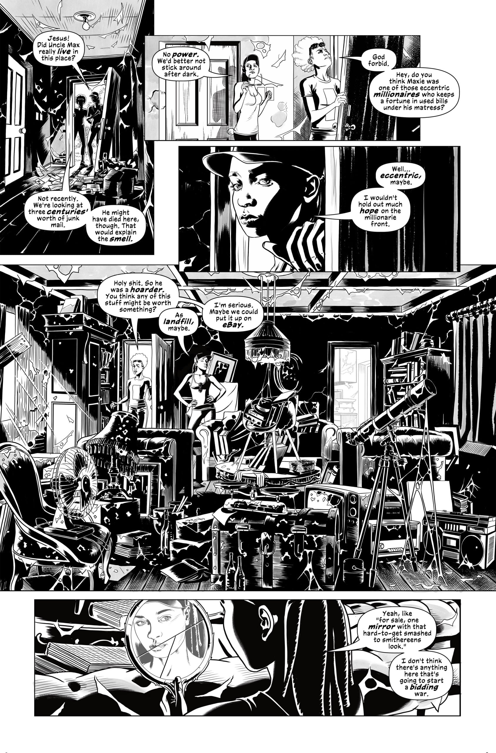
PABLO: Other than the added gray-tones, I believe I slightly adjusted the placement of one or two balloons in a couple of pages, but nothing more meaningful than that. When I was first drawing the pages, particularly in the scenes that take place in the interior of the ghostbox, it was difficult to stop adding to them cause I always felt I could be drawing more- one more hill, or another house, another ghost. So it took quite a bit of self-control this second time around to not start messing around with the lineart and do that. Which is good, cause otherwise the book would not be out yet.
Visual Research
GVN: In your original pages, were there specific visual influences — photography, film, comics — that shaped the tone of Ghostbox, and perhaps seem more emphatic now that readers can see the raw linework?
PABLO: In terms of visual reference, there was a ton of research work I had to do in order to create a believable, grounded setting for the series. For example, I’ve unfortunately never been to the English countryside, so I spent hours looking for any sort of reference I could find to piece an environment together that felt organic for me to draw. I re-watched all three seasons of Happy Valley (Sarah Lancashire is brilliant, btw) which were a big help with all the police stuff.
In terms of comics I wasn’t looking at anything in particular, but I think all those artists that I mentioned inspired me in my formative years influence my work today even at a subconscious level. When I was drawing the scenes that take place inside the ghostbox where the ground is being turned apart by this energy that’s consuming it and there are a multitude of characters in every panel… I remember feeling it was a small, humble homage to George Perez’ masterful work in Crisis on Infinite Earths, which clearly left a huge mark on me. So, there are probably a few things like that that can be traced back to the artists I admire.
Fitting So Much Story
GVN: What was the most surprising thing about returning to Ghostbox after so much time — something you’d forgotten you did or something you now see with fresh eyes?
PABLO: I remember being aware of this when I first drawing them, but going through the pages again reminded me of how much story we were able to fit in every one of them. Mike’s scripts are bursting with wonderful and imaginative scenes and ideas, and almost every panel he writes moves the story forward in a meaningful way. If you were to take out and skip a page of the book, odds are you would lose track of what’s happening in the story. I learned a lot from him during this process and I’m still a bit surprised that I was able to mostly keep up. And I say ‘mostly’ cause there were several instances that what he described was so rich and fascinating that I would end up giving up and saying ‘screw it, this is so cool it deserves a spread’.
A Note to Self
GVN: Thank you, Pablo, for sharing some of your time today. Finally, if you could give your past-self one artistic note during the original run, what would it be?
PABLO: ‘Add the gray-tones the first time around so you don’t have to go through every page again a year later.’
A huge thanks to Mike and Pablo for taking the time to revisit the world of Ghostbox with us and for sharing the creative decisions behind this striking reissue. Whether you’re returning to the story or discovering it for the first time, this edition offers a fresh lens on a modern genre standout. Issues #1 and #2 are now available on Comixology Originals.

Senior Writer at GeekVibesNation – I am a 60 something child of the 70’s who admits to being a Star Trek/Star Wars/Comic Book junkie who once dove headfirst over a cliff (Ok, it was a small hill) to try to rescue his Fantastic Four comic from a watery grave. I am married to a lovely woman who is as crazy as I am and the proud parent of a 21-year-old young man with autism. My wife and son are my real heroes.


