

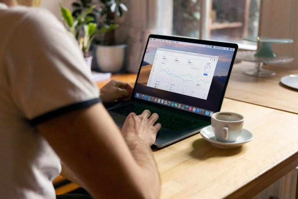
Anyone who has stared at three different spreadsheets, two browser tabs and a half finished chart before a Monday meeting knows the feeling. The data is technically all there. It is just scattered across so many places that pulling it together takes longer than actually acting on it.
That is exactly the problem smarter dashboards are solving. Rather than treating data as something you dig for, modern dashboards treat it as something that greets you the moment you log in, already sorted, already visualised and already pointing towards what matters most.
Why decision-making got so complicated in the first place
It is not that businesses have less data than they used to. If anything, they have far more. Every platform, every campaign and every customer touchpoint now leaves a digital trail. The trouble is that this information tends to live in separate silos, each with its own login, its own format and its own way of defining success.
For anyone trying to make a quick, confident decision, that fragmentation is exhausting. You end up spending more time reconciling numbers than actually using them. And the longer that process takes, the more likely it is that the moment to act on an insight has already passed.
What makes a dashboard actually “smart”
A smart dashboard does more than display numbers in a nicer font. The best ones share a few common traits.
They pull everything into one place. Rather than jumping between systems, a good dashboard consolidates data from multiple sources so you get a single, consistent view.
They highlight what has changed. Instead of leaving you to spot a dip or a spike yourself, smarter tools flag shifts automatically, so your attention goes straight to what needs it.
They adapt to the question you are asking. Static reports answer the questions someone thought to ask last month. Dynamic dashboards let you filter, drill down and explore in real time, which matters when the question in front of you is happening right now.
They explain, not just display. Some of the newer platforms go a step further and add plain language commentary alongside the charts, essentially doing the first pass of analysis for you.
A good example of this shift can be seen in how advertising performance is now tracked. Where teams once built manual reports channel by channel, many now rely on a paid social reporting dashboard to bring performance across platforms into a single, easy to read view, cutting hours out of a task that used to eat up an entire afternoon.
The everyday benefits of clearer data
The appeal of smarter dashboards is not really about the technology itself. It is about what that technology frees people up to do.
When information is easy to interpret, decisions tend to get made sooner, and with more confidence, because there is less second guessing over whether the numbers are even accurate. It also becomes far easier to spot a small problem before it becomes a big one, since trends show up clearly rather than being buried in a spreadsheet no one has opened in weeks.
There is a knock on effect for teams too. When everyone is looking at the same dashboard rather than their own version of the truth, conversations shift away from arguing about whose numbers are right and towards actually discussing what to do next. Meetings get shorter, and they get more useful.
Dashboards are changing more than marketing
While a lot of the buzz around smarter dashboards has come from marketing and advertising, the underlying idea, giving people a clear, live view of what is happening so they can act faster, is showing up well beyond that world.
Similar thinking is already reshaping how service based businesses schedule and track their day to day operations, where a clear real time view of jobs, technicians and workloads is replacing whiteboards and phone calls with something far easier to act on quickly.
Getting the most out of a dashboard
Having access to a good dashboard is only half the job. A few habits make a real difference to how much value you actually get out of one.
-
Start with the questions you actually need answered, rather than trying to track every metric available. A dashboard cluttered with numbers nobody checks is not much better than no dashboard at all.
-
Revisit it regularly, not just when something goes wrong. The real value comes from spotting gradual shifts early, not only reacting to obvious problems.
-
Keep it simple enough that anyone on the team can read it, not just the person who built it. If a dashboard needs a training session to understand, it is probably too complicated.
-
Let it prompt conversation rather than replace it. The best decisions still come from people discussing what the data means, with the dashboard doing the heavy lifting of getting everyone on the same page first.
Smarter dashboards are not just a tidier way to look at numbers. They are changing how quickly and how confidently people can make decisions, whether that is adjusting an ad campaign midweek or reshuffling a technician’s schedule on the fly. As more of daily working life becomes data driven, tools that turn scattered numbers into clear, immediate insight are quickly becoming less of a nice extra and more of a genuine necessity.

Andrea Bell is a blogger by choice. She loves to discover the world around her. She likes to share her discoveries, experiences and express herself through her blogs. You can find her on Twitter:@IM_AndreaBell