
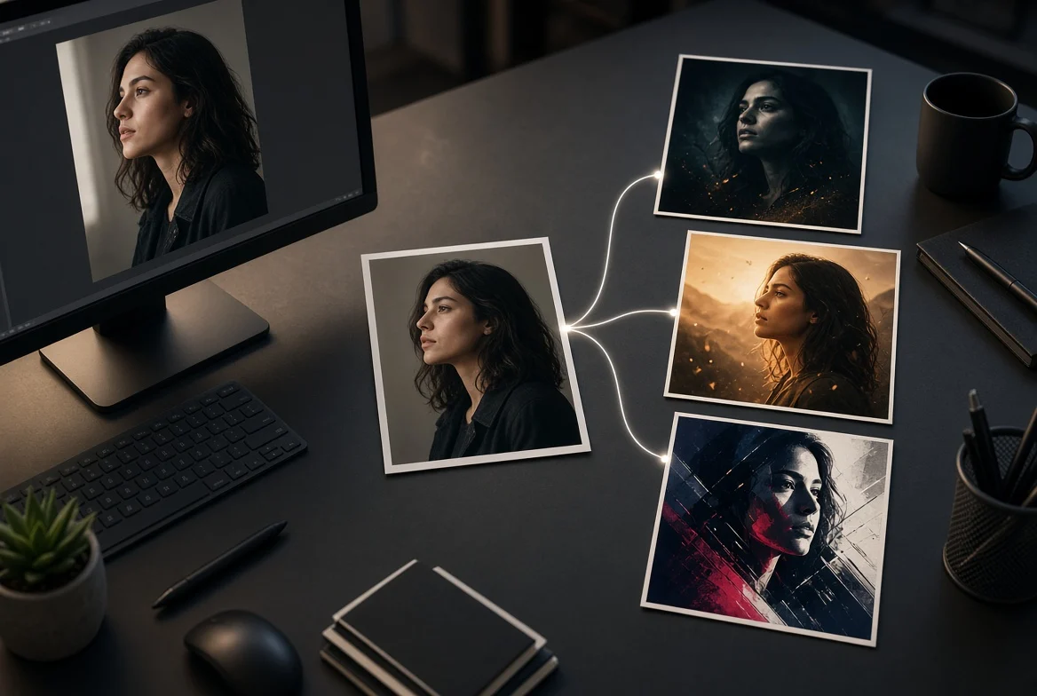
Picture a friend standing under a streetlight in a raincoat. In the original photo, they’re waiting for a ride. On a poster, that same shot could sell a small-town mystery, a science-fiction short, or a quiet drama. Changing the mood is the fun part. The frustration starts when the best-looking version changes the actor’s face or leaves nowhere to put the title.
An editor like Image to Image AI lets you start with the photograph instead of generating a new scene from scratch. For this exercise, keep the actor and framing fixed as your brief, then vary the light and atmosphere. You’ll end up with three directions you can compare before spending time on type and layout. Before writing your prompts, browse the AI image prompt library for ways to describe light and texture.
- Decide What the Edit Isn’t Allowed to Change
Pick a photo you own or have permission to edit. Look for a readable silhouette and some empty space above the subject or off to one side. That space is doing a job: it gives the title somewhere to live without covering a face.
Borrow specific language, not the whole prompt. “Cold side light and a thin haze” tells the editor more than “make it cinematic.” An example built around a close-up may also introduce framing you don’t want.
Start every variation with the same instruction:
Keep the subject’s face, pose, raincoat, and framing. Leave the upper-left area clear for a title. Don’t add letters or logos.
Think of that sentence as your production brief, not a lock. You’ll still need to compare the output with the source.
- Write Three Versions With a Reason to Exist
Upload the original photo for each version, and append one direction to your base instruction:
- Small-town mystery: Cool the streetlight to a pale blue. Add a thin layer of fog behind the subject. Keep the face legible and leave the foreground clear.
- Near-future sci-fi: Add a muted magenta reflection on the pavement and a faint cyan edge light on the coat. Keep the street and camera angle. Don’t add futuristic props.
- Quiet drama: Use soft amber window light and lower the contrast. Let the background recede without turning it black. Keep the feeling of an ordinary street at night.
It’s tempting to feed the mystery result back in and ask for something warmer. Start from the original instead. Otherwise, an accidental change from the first edit can carry into the next one, and you won’t know if you’re reacting to the new lighting or to a subtly different face.
- Test the Poster at the Size People Will See It
Make three copies of the same layout and drop one concept into each. Add a working title in a regular design tool, using the same typeface, size, and position across all three. Now shrink them to the size of a phone thumbnail.
Ask two questions: Can I read the title without zooming? Do I get the intended genre before I read it? A fine fog texture that looks great on a full-size monitor may turn into a gray patch on a phone. A neon reflection might pull your eye away from the title. This test helps you choose the strongest poster, not just the prettiest image.
- Check the Face Before You Share
Put the leading concept next to the source at full size. Look at the face, hands, coat seams, and obvious straight lines like the curb. Remove any invented text or signs, and don’t use an edit that misrepresents the actor or the film. If the composition works and only one shadow is wrong, a local adjustment in a conventional editor may be quicker than another full generation.
The Bottom Line
Use AI to test the art direction, then build the poster yourself. Start with one photo, generate three lighting treatments from the same source, and put the same title on each. The best concept is the one that still tells the story at thumbnail size.

Caroline is doing her graduation in IT from the University of South California but keens to work as a freelance blogger. She loves to write on the latest information about IoT, technology, and business. She has innovative ideas and shares her experience with her readers.