
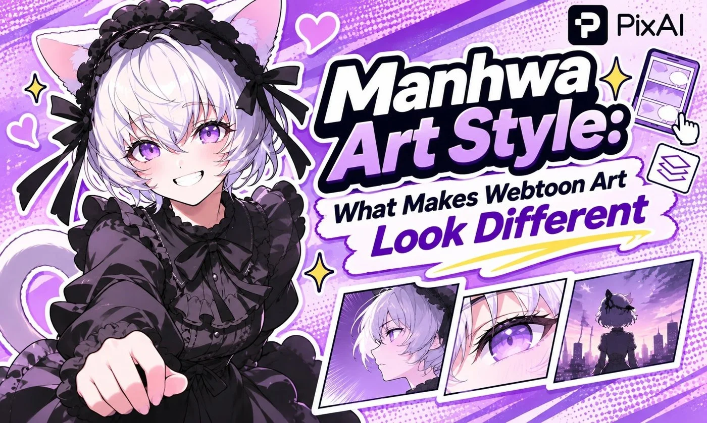
The manhwa art style people often recognize online is shaped by two visible choices: full-color digital rendering and a vertical reading format. A tall panel can hold a figure, a pause, or a reveal as the reader scrolls. Color carries part of the atmosphere that black ink and screentone might carry on a printed page.
A quick definition first, because the two words get blurred. Manhwa simply means Korean comics. Webtoon refers to digital comics built for vertical scrolling. They overlap a lot, but neither one is a drawing style: plenty of manhwa is in print, and plenty of scrolling comics come from outside Korea. What people usually mean by “the manhwa look” is the recurring visual vocabulary of contemporary full-color Korean webtoons, and that’s what this guide covers.
For an example of traditional Korean manhwa in print, Geek Vibes Nation previously covered The Breaker Volume 2 Omnibus Edition, a martial arts series known for its detailed artwork and action sequences.
How the Manhwa Art Style Works With the Scroll
A printed comic page lets the reader see several panels together. A vertical strip reveals the sequence through movement down the screen. That changes where a creator can place an expression, an interruption, or a large image.
Imagine a character approaching a closed door. A tight sequence can move quickly from the hand to the handle. More space before the next image can delay the reveal. A tall panel beyond that gap might show the entire room, asking the reader to keep scrolling before the scene resolves.
The panel shapes and the spaces between them are part of the visual design. A portrait generated in a tall frame can borrow the composition, but it won’t demonstrate that pacing by itself. You need a sequence to control what readers see next.
This approach to digital storytelling continues to influence new comics. Geek Vibes Nation previously shared an exclusive look at the concept art for the WEBTOON series Bad Influence, offering another example of character design for a scrolling comic.
Manhwa vs Manga Art Style: Compare Specific Choices
The fair comparison is a contemporary full-color webtoon against a typical black-and-white Japanese print manga. You’ll find exceptions to every point below, so read them as tendencies you can spot and borrow.
Reading direction and layout. Vertical webtoons lead the eye downward, with text and images arranged for that motion. Japanese manga traditionally reads right to left across panels and pages. A page composition must account for neighboring panels; a scroll composition must account for what enters the screen next.
Color and tonal structure. A full-color scene can distinguish a room through warm lighting, cool shadows, or a repeated accent color. Monochrome manga often uses black shapes, hatching, and screentone to separate planes. Neither approach removes the need for clear light and dark values.
Proportions and faces. This is the difference most readers notice first. Romance and action webtoons in particular lean toward long legs, long necks, defined noses, and carefully modeled jaws. Manga covers a far wider range, from very simplified faces to near-realism, so a long neck on its own won’t tell you where a comic came from.
Shading and effects. Soft digital gradients, rim light, and reflected color give many webtoon panels their glossy finish, and that polish does a lot to make the style look expensive at a glance. Hard-edged shadows show up too, especially in action scenes that need clarity. A black-and-white page can build just as much atmosphere through ink placement and texture.
Clothing and styling. Romance-focused webtoons treat fashion as characterization. A tailored coat, a fitted uniform, or a carefully layered casual outfit tells you someone’s status before they speak, and full color lets the fabric carry more of that. Look at the collar, shoulder line, and folds if you want to reproduce it; “fashionable” is too vague to draw. Manga uses clothing the same way, but often renders it in line and tone.
Whitespace and rhythm. A scrolling strip can use a long gap to separate beats without turning a page. Printed manga works within page and spread boundaries, using panel size, gutters, and page turns to shape rhythm. Both formats depend on controlling the reader’s attention.
| Dimension | Manhwa / Webtoon | Japanese Manga |
|---|---|---|
| Comparison scope | Contemporary full-color Korean scrolling comics | Typical monochrome Japanese print manga |
| Reading flow | Mainly downward through a vertical strip | Traditionally right to left across panels and pages |
| Color | Full color can carry atmosphere and scene changes | Black ink, white space, and screentone often carry tonal structure |
| Figure design | Some genres favor elongated proportions and modeled faces | Proportions range from simplified to naturalistic |
| Surface rendering | Digital gradients, flat fills, or both; lighting effects vary | Line weight, solid blacks, hatching, and tone; color pages also exist |
| Clothing | Genre-specific fashion may receive detailed color treatment | Genre-specific fashion may be defined through line and tone |
| Pauses and reveals | Panel spacing and vertical distance can delay information | Panel arrangements, gutters, and page turns can delay information |
| Shared foundation | Readable staging, expressive faces, consistent characters | Readable staging, expressive faces, consistent characters |
Three Genre Directions With Different Visual Priorities
Romance Fantasy and Court Settings
Start with the relationship between the figure and the room. A structured jacket against an ornate doorway can suggest status. Soft face shading, fabric highlights, and restrained decorative detail can keep the expression readable even when the costume is elaborate. Avoid asking every surface to sparkle.
Romance fantasy is also an important part of webtoon storytelling. GVN previously featured an exclusive look at SubZero Volume 1 from Oni Press, a popular romance fantasy webtoon that made the transition to print.
Action and System Stories
A strong silhouette needs to survive effects and motion. Contrast the figure against the environment, choose a clear action line, and place the brightest effect where the eye should land. Interface-like graphics, when part of the scene, should support the action rather than cover the pose. Dense effects cannot repair unclear staging.
Modern Romance
Small differences in gaze, posture, and distance can do much of the work. A plain office corridor might need only a window reflection and a warm accent to frame a conversation. Clothing fit and everyday props can tell you about a character without requiring an elaborate background.
When switching between a quiet conversation and an action beat, keep the hair silhouette and eye proportions beside both drafts for comparison.
Describe the Image Before Naming the Style
A prompt that only says “Korean manhwa art style” leaves the composition, anatomy, lighting, and setting unresolved. To explore a manhwa style, decide what you want viewers to notice, then write those visible choices. A style label can remain as context, but it shouldn’t carry the entire brief.
A Quiet Modern Scene
For a quiet modern scene, try:
An original adult character waits beside a rain-covered office window, holding a closed umbrella. Portrait-oriented composition, waist-up view, clean fine contours, slightly elongated proportions, softly shaded face, navy coat with believable fabric folds, cool window light and a small warm reflection from the hallway. Full-color contemporary Korean webtoon-inspired illustration, simple background, no text.
A Court-Setting Costume Study
For a court-setting costume study:
An original adult royal archivist stands beside a tall wooden doorway. Full-length vertical composition, structured ivory jacket with a dark green sash, modest brass fastenings, relaxed hands holding a closed book. Refined linework, full-color digital shading, soft afternoon light, limited background ornament, face and costume clearly separated.
An Action Scene
An action scene needs different instructions:
An original adult courier leaps across a narrow gap between rooftops. Tall composition, readable three-quarter silhouette, short dark coat pulled backward by motion, one bright amber signal on the wrist. Clean contours, firm shadows, cool evening buildings, restrained motion streaks behind the figure, full-color digital comic illustration, no lettering.
Treat these as starting points. If an image feels vague, change one concrete thing at a time: the crop, the shadow edge, the body proportion, or how much background detail you allow.
Check the Look Across More Than One Image
A webtoon art style needs to hold together beyond a single polished portrait. Put a neutral face, a three-quarter view, and a wider scene beside each other. Compare eye shape, jaw, hairline, and the way light falls across skin and fabric.
For a short sequence, draft one simple beat across a few panels before adding dialogue. Keep character colors stable, leave room for lettering, and preview the sequence on a narrow screen. The principles of webtoon art become easier to assess when the face, setting, and spacing have to work together.
Where PixAI Fits
So much of this look lives in lighting and composition that a style label alone won’t get you there. That’s the argument for a model that reads whole sentences. PixAI is an anime-focused AI art generator, and its Tsubaki.3 model supports full scene descriptions, allowing creators to describe the crop, the coat, and the hallway light directly in a prompt.
PixAI has also introduced Serin, a model designed for Korean-style artwork, including visual influences from manhwa and webtoons. The platform also provides a character consistency and prompt guide, which explains how creators can maintain recognizable character features across different scenes and visual treatments.
For the comics side, PixAI’s interview with manga creator Mirai covers making pages with Tsubaki.3 from a working creator’s point of view.
A Visual Brief for Your Next Scene
- Choose the genre and the moment the image should communicate.
- Set a vertical crop with a clear focal point.
- Describe proportions, contours, shading, and clothing separately.
- Keep face and costume colors consistent across views.
- For a sequence, review the gaps and reveals as well as the panels.
Write one original scene with those decisions, then explore its color and lighting on PixAI.

Andrea Bell is a blogger by choice. She loves to discover the world around her. She likes to share her discoveries, experiences and express herself through her blogs. You can find her on Twitter:@IM_AndreaBell