

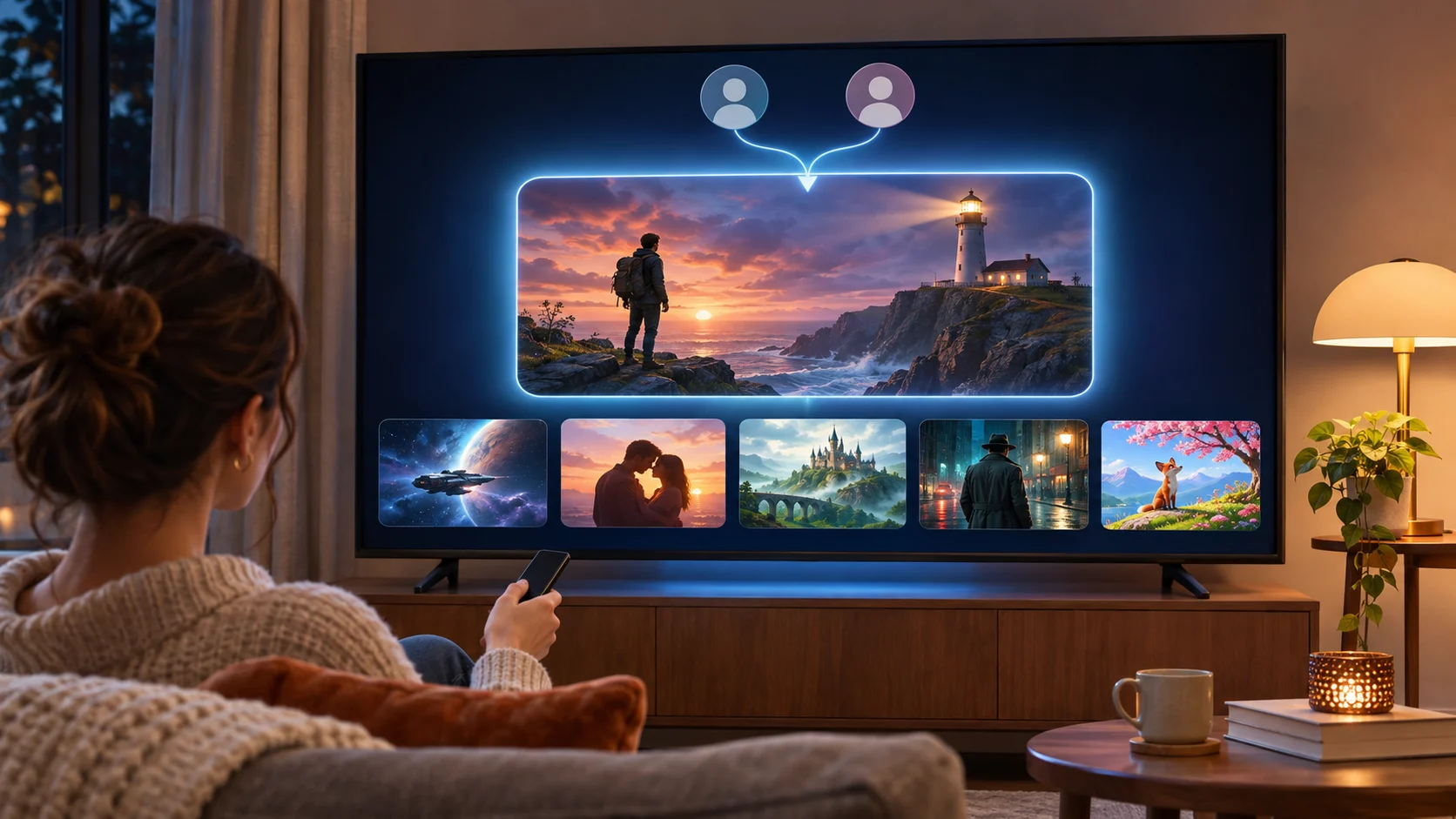
Open your streaming app tonight and you may not be looking at the same homepage as someone else. You are looking at an experience shaped by your account, viewing history, and recommendations. The grid of rows looks fixed, but the titles, row positions, and artwork can vary between viewers.
A lot of the familiar assumptions about streaming interfaces come from how these products worked years ago. Recommendation technology continues to evolve, and Netflix’s recent work offers a useful look at where personalized homepages are heading.
Here are some assumptions worth revisiting.
The Homepage Is a Live Render, Not a Static Template
Most people picture the streaming homepage as a template with slots filled in. Hero banner at the top, trending row, continue watching, a few genre shelves. The general layout may be familiar, but the content and its arrangement can be highly personalized.
Netflix engineers have described a system called GenPage, which uses a generative model to construct personalized homepages. Rather than relying entirely on separate ranking stages, GenPage generates a structured sequence of rows and titles based on user information and request context. Netflix has reported promising results from testing the approach.
The practical effect of personalization is that two subscribers in the same household can open the app and see different recommendations, row orders, and promotional images. If you have ever argued with a partner about whether a title was “on the front page yesterday,” the difference may come down to which profile was being used.
A thoughtful web development partner can apply a related principle to a smaller operation: designing around visitor needs and behavior rather than treating the homepage as a one-time deliverable.
The Algorithm Picks Images, Not Just Shows
The common assumption is that recommendation engines rank titles and the artwork is whatever the studio delivered. But streaming platforms such as Netflix have also used personalized artwork to help viewers discover content. Different promotional images can be selected from available variants based on viewing preferences and other signals.
A romantic comedy might surface a two-shot of the leads for one viewer while an ensemble cast image goes to another — same title, different visual pitch.
Thumbnails are prominent during browsing. Artwork helps communicate a title’s appeal before a viewer reads the description, making image selection an important part of the discovery experience.
You Decide in Seconds, Not Minutes
There is a persistent belief that viewers deliberate carefully, reading synopses and watching trailers before committing. Earlier Netflix research suggests that browsing decisions can happen much faster. According to research described in a paper by Netflix researchers, a typical member might lose interest after roughly 60 to 90 seconds of choosing, having reviewed 10 to 20 titles and examined perhaps three in detail.
Those findings are from earlier research, not a measurement of every viewer’s current behavior. Still, they illustrate why the first few screens of recommendations matter. If a viewer doesn’t find something appealing quickly, the risk of abandoning the search increases.
That helps explain the effort invested in recommendation rankings, homepage layouts, and promotional artwork. Each element contributes to how easily viewers find something they want to watch.
Why This Matters Outside of Streaming
The streaming homepage is a prominent example of a broader approach to digital experiences. Rather than treating every page as a fixed arrangement, businesses can use visitor behavior, testing, and personalization to decide what information to emphasize. Retailers, publishers, SaaS platforms, and marketing websites can apply these techniques at different levels of sophistication.
For most businesses, the lesson is not to copy Netflix. Its infrastructure and content catalog create challenges that a typical business website doesn’t face. The lesson is that homepage decisions — hero images, content order, and calls to action — don’t have to be permanent. They can be evaluated and refined as visitor needs and business goals change.
The Scrolling Problem Is Not Going Away
Even with sophisticated recommendation systems, viewers can still spend time searching for something to watch. Large catalogs, changing preferences, and competing choices make discovery an ongoing challenge. Adding more rows isn’t necessarily the answer. Better recommendations, clearer presentation, and useful ways to refine a search may help viewers find relevant content sooner.
Netflix’s GenPage research illustrates one direction for improving that experience: considering the homepage as a connected set of recommendations rather than a collection of independently ranked sections.
The broader lesson applies well beyond streaming. A homepage should help visitors recognize relevant options quickly, while making it easy to explore further when the first recommendation doesn’t fit. Personalization can support that goal, but a useful experience still depends on clear design and content that meets the visitor’s needs.

Ashley Rosa is a freelance writer and blogger. As writing is her passion that why she loves to write articles related to the latest trends in technology and sometimes on health-tech as well. She is crazy about chocolates. You can find her at twitter: @ashrosa2.