

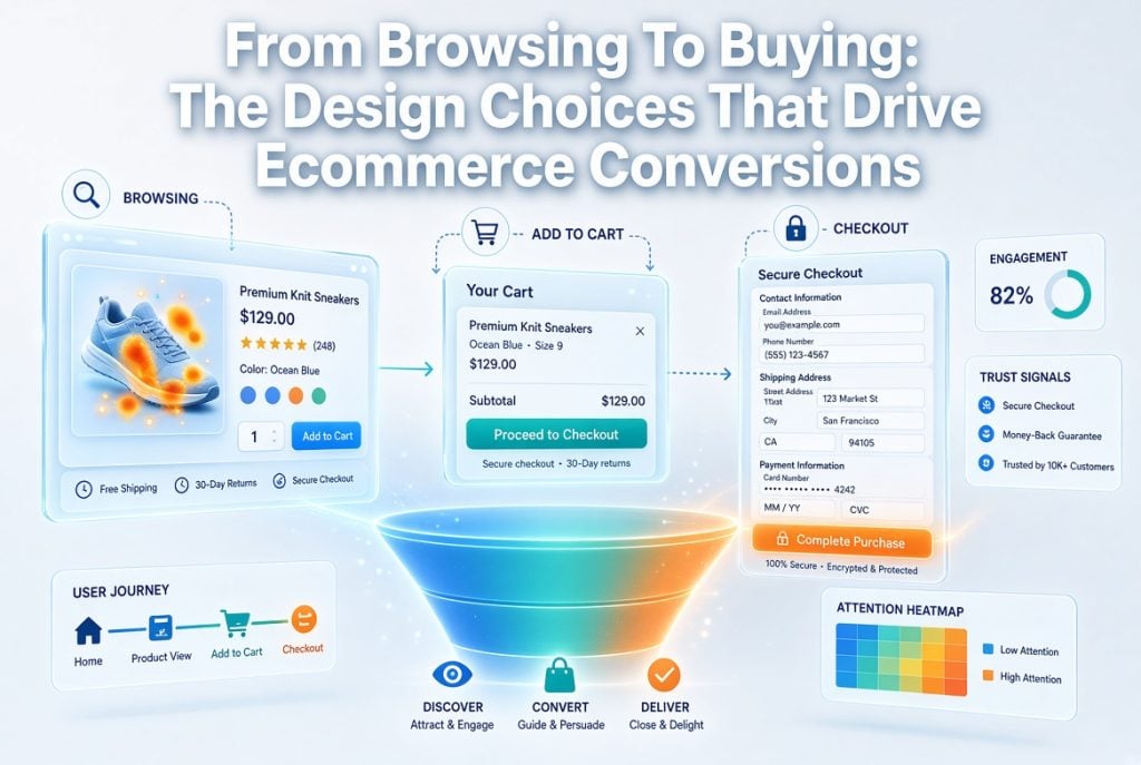
Getting shoppers to your online store is only half the battle.
The problem? Converting those browsers into customers. Let’s be real: nine times out of ten, ecommerce stores drop sales due to one culprit: bad design.
Good website design does three key things:
- Builds instant trust
- Guides shoppers to checkout
- Turns visitors into paying customers
Here’s the good news…
You don’t need millions of dollars and an army of consultants. A few strategic design decisions can make your store sell itself.
Let’s dive in!
Here’s what’s inside:
- Why Website Design Impacts Conversions
- The First Impression Problem
- 6x Design Choices That Turn Browsers Into Buyers
Why Website Design Impacts Conversions
Website design is the most underrated part of ecommerce.
Consider this. You can funnel as much traffic as you want to your store, but if the design is cumbersome, unintuitive or slow – customers will leave. And not return. No wonder professional ecommerce brands invest in design from day one.
When you work with a dedicated team such as EnvisageDigital Magento Agency, your store’s website design is created with one goal in mind. Making your visitors into paying customers. Awesome web design isn’t about how good it looks. It’s about making it ridiculously easy for your customers to part with their cash.
Here’s why it matters so much:
Statistics indicate that 94% of first impressions are design-centric. People make judgments about your store before they see your product. If your design isn’t clicking, you’ve lost them already. Period.
The First Impression Problem
You have less time than you think.
Google research revealed that users form an opinion in just 50 milliseconds. That’s quicker than the blink of an eye. In that moment, consumers decide if your store deserves their time…or if they’ll press the back button and visit a competitor.
So what makes a strong first impression?
It comes down to a few key website design elements:
- Clean layout with plenty of white space
- Clear navigation menu
- Strong hero image or banner
- Obvious brand identity
- Easy to spot search bar
If you get them correct, customers will stay long enough to shop. Mess them up, and they’ll leave before seeing your favorite product.
6x Design Choices That Turn Browsers Into Buyers
Ok, let’s get to the good part. These website design decisions will actually help improve ecommerce conversions.
Skim through all of them, choose a few you enjoy, and begin applying today. Seriously, it’s that simple!
Mobile-First Design
More than half of ecommerce traffic now comes from mobile devices.
The problem is… Most websites are designed for desktop first. Then crammed into a mobile phone screen as an afterthought. That’s a HUGE mistake and you’re losing sales every day because of it.
Mobile-first website design means:
- Buttons big enough for thumbs
- Fast loading images
- Simple checkout with autofill
- Menus that work with a swipe
- Text that’s readable without zooming
Mobile-friendly websites convert up to 40% better than sites that aren’t. That’s not insignificant. If your store isn’t mobile optimised you are literally giving money to your competitors.
Fast Loading Speed
Speed is a website design choice too.
Every second your store loads your losing customers. Did you know that 40% of shoppers will leave your store if it takes more than 3 seconds to load. Three seconds. Literally.
Here’s how to keep your store fast:
- Compress all product images
- Use a Content Delivery Network (CDN)
- Remove unused plugins and scripts
- Choose a fast hosting provider
- Enable browser caching
SEO is better with a fast site, not just conversions! High speed equals higher rankings in Google. Double blessings!
Clear Product Pages
Your product pages are where the sale actually happens.
Should they be unclear, cluttered or lacking critical information, customers will not purchase. Period. Elements of an effective product page include:
- High-quality images from multiple angles
- Clear pricing (with any discounts shown)
- Detailed but scannable descriptions
- Prominent “Add to Cart” button
- Customer reviews and ratings
- Shipping and return info
The Add To Cart button is your headline actor. Make it large and brightly colored so it sticks out from the rest of the page. This is the single most important element of your product page website design. Don’t skimp on it.
Simple Navigation & Search
If shoppers can’t find what they’re looking for, they can’t buy it.
Ecommerce Conversion Rates average around 2-3%. Conversion rates for ecommerce websites with clean navigation and a powerful search function are significantly higher. The reason? Eliminating friction and allowing consumers to find what they’re looking for in 1-2 clicks.
Good ecommerce navigation should include:
- Clear main categories
- Sub-categories that make sense
- A working search bar with autocomplete
- Filters for size, price, colour etc.
- Breadcrumbs so shoppers know where they are
Try to accomplish this. It should take no more than two clicks for someone visiting your homepage to reach a product page. If it takes more than two clicks they are gone.
Trust Signals Throughout
People don’t buy from stores they don’t trust.
Which is why effective website design incorporates trust signals throughout the online shopping experience. These include:
- Customer reviews and testimonials
- Security badges near checkout
- Money-back guarantee icons
- Real contact information (phone, email, address)
- Social proof (“X people bought this today”)
Sprinkling your page with these simple touches can significantly increase trust – and conversions. They’re barely any effort or cost for you and they’ll pay off immensely.
A Frictionless Checkout
Cart abandonment is a killer.
The majority of cart abandonments occur during the checkout process. Whether it’s taking too long, being too difficult, or asking for too much information. You want your checkout web page design to be as seamless as possible.
Here’s what a great ecommerce checkout looks like:
- Guest checkout option (no forced sign-up)
- Progress bar showing steps remaining
- Multiple payment methods
- Auto-filled address fields
- No surprise shipping costs at the end
Every additional field on your checkout form is a sale lost. Be lean. Be quick. Increase conversions.
Bringing It All Together
Website design and ecommerce conversions go hand in hand.
If your store is slow, confusing or difficult to use on mobile – no amount of marketing will save you. When your website design is dialed in, everything else falls into place. More visitors become buyers. More buyers become repeat customers. More repeat customers automate your revenue growth.
Quick recap of what matters most:
- Nail the first impression with clean design
- Design for mobile first, not last
- Keep your site fast (under 3 seconds)
- Make product pages clear and scannable
- Use simple navigation and search
- Add trust signals at every stage
- Cut friction from your checkout
Choose one section to improve upon this week. Make a small change, test it, then rinse and repeat for the next section. Your conversion rate will reward you.

Sandra Larson is a writer with the personal blog at ElizabethanAuthor and an academic coach for students. Her main sphere of professional interest is the connection between AI and modern study techniques. Sandra believes that digital tools are a way to a better future in the education system.