

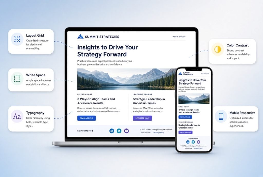
Email newsletter design directly affects whether a recipient will read the message, click the CTA, or close the email within the first few seconds. However, professional email design is not about adding visual effects or decorative elements. Its purpose is to create a clear interaction path: capture attention, communicate the value proposition quickly, and guide the recipient toward the desired action.
For teams that regularly produce a high volume of emails, a visual builder can simplify the process of creating and maintaining templates without requiring constant manual HTML development. For example, an email newsletter builder Stripo allows marketers to assemble newsletters using ready-made content blocks, responsive layouts, and reusable design components, making it easier to maintain consistency across campaigns.
Where Email Newsletter Design Begins
Before developing a template, define the purpose of the specific email. The design of a promotional campaign, transactional message, newsletter digest, or re-engagement email will differ not only visually but also structurally.
Key questions to answer before starting the design process include:
- What action should the recipient take?
- What content is the most important?
- Who is the recipient and where are they in the customer journey?
- Which device does the audience primarily use to read emails?
- Which brand identity elements need to be incorporated?
- What limitations exist within the email platform and supported email clients?
If the primary goal is to drive traffic to a website, the design should support that action. If the email contains multiple pieces of content, such as a newsletter digest, the design needs to establish a clear visual hierarchy between them.
Therefore, email design should begin with information architecture rather than with choosing colors or images.
Key Elements of a Professional Email Newsletter
Despite the differences between email formats, most effective email templates are built around a recurring set of components.
1. Preheader
The preheader is the text displayed by an email client next to or below the subject line. It complements the subject line and gives recipients additional context before they open the email.
If the subject line communicates the main offer, the preheader can provide an additional benefit or clarify the content.
For example:
Subject: The New Collection Is Here
Preheader: Discover the first styles of the season and exclusive offers for returning customers
Avoid simply repeating the subject line in the preheader. Instead, use these two elements as parts of a single message.
2. Email Header
The header typically contains the brand logo, company name, and, when necessary, navigation.
For most newsletters, a compact header is sufficient. An oversized header increases the distance between the top of the email and the main content, forcing users to scroll before they even see the offer.
For commercial newsletters, navigation may include several key categories. However, adding the entire website navigation is not always justified: every additional link creates another competing action.
3. Hero Section
The hero section is the primary visual element at the top of an email. It typically consists of an image or illustration, a headline, a short description, and a CTA.
Its purpose is to answer three questions within a few seconds:
- What is being offered?
- Why is it relevant?
- What should the recipient do next?
Avoid overloading the hero section with multiple messages. If it contains several offers, long blocks of text, and multiple buttons, the visual hierarchy becomes unclear.
4. Main Content
The main content follows the hero section. Its structure depends on the purpose of the campaign.
For e-commerce, it may include product cards, categories, or curated collections. For B2B, it may contain product benefits, a case study, or analytical content. For SaaS, it could explain functionality, use cases, and provide a CTA to request a demo.
When there is a large amount of information, divide it into separate content modules. Each module should have a clear purpose and should not compete with the main message of the email.
5. CTA
The Call to Action is one of the most important elements of email design.
A CTA should be:
- visually noticeable;
- concise;
- understandable without additional explanation;
- directly connected to a specific action.
“Learn More” is a universal option, but it is often less informative than a specific CTA such as “Shop the Collection,” “Start for Free,” “Book a Demo,” or “Get the Offer.”
The number of CTAs depends on the email structure. A short promotional email may need only one primary button. In a longer email, the main CTA can be repeated after key sections so that users do not have to scroll back to the top.
6. Footer
The footer contains contact information, social media links, legal information, and an unsubscribe link.
The footer should not be treated as a purely technical element. It contributes to trust and helps ensure compliance with applicable regulations and email platform requirements.
Visual Hierarchy: How to Direct Attention
Users rarely read a commercial email from beginning to end. They scan it, focusing on headlines, images, buttons, and highlighted pieces of information.
The designer’s task is therefore to create an obvious sequence of attention.
It can be broadly structured as:
main message → key benefit → proof/details → CTA.
This can be achieved through:
- font size;
- contrast;
- spacing;
- element positioning;
- color;
- imagery;
- block size.
Avoid making every element a visual focal point. If the headline, subheadline, multiple buttons, images, and individual phrases are all highlighted, the recipient will struggle to understand where to focus.
The more elements compete for attention, the weaker the visual hierarchy becomes.
Color Palette
Email colors should extend the brand’s visual identity.
A typical palette may include:
- primary brand color;
- secondary color;
- neutral background color;
- text color;
- separate accent color for CTAs.
The CTA button should have enough contrast against its background while still fitting into the overall visual system.
Avoid using large numbers of bright colors simply to make an email look more noticeable. In professional email design, contrast should primarily be used to guide attention.
Dark mode should also be tested separately. Some email clients automatically modify backgrounds, text colors, and other elements, meaning a design that looks correct in light mode may lose contrast in dark mode.
Typography
Email newsletters should generally use fonts with good support across major email clients. If the brand uses a custom font, test how the email looks in environments where that font is not supported.
Pay particular attention to:
- body text size;
- line height;
- text-to-background contrast;
- heading sizes;
- spacing between sections;
- line length.
Text that is too small reduces readability on mobile devices. Conversely, overly long lines make desktop reading more difficult.
Consistency is equally important. If headings at the same hierarchy level use different sizes and styles, the structure becomes harder to understand.
Images: Quality vs. Loading Speed
Images are a critical element of many email newsletters, particularly in e-commerce. However, using too many large images can significantly increase loading time.
Before sending, make sure to:
- optimize image file sizes;
- use appropriate formats;
- check image quality on Retina displays;
- add alt text;
- avoid placing critical information exclusively inside images.
The last point is especially important. If images are blocked, recipients should still understand who sent the email and what the main offer is.
For example, a price, discount, or key CTA should not exist only as part of an image.
Responsive Email Design
A significant share of email communication is viewed on mobile devices, making responsive design a basic requirement rather than an optional feature.
The mobile version should be checked for:
- container width;
- text size;
- CTA size;
- spacing between interactive elements;
- block order;
- image scaling;
- navigation behavior;
- absence of horizontal scrolling.
Buttons deserve particular attention. If the clickable area is too small, the email becomes difficult to use on touchscreen devices.
The mobile version should also not simply be a scaled-down copy of the desktop version. In some cases, it makes sense to change the order of content blocks, hide secondary navigation, or shorten the text.
Choosing the Email Template Width
Most modern email templates use a centered container with a fixed maximum width that adapts to smaller screens.
In practice, a desktop content area of around 600–700 px is commonly used. However, the exact width depends on the structure of the email, the number of columns, and the design requirements.
The key is not to use the entire available screen width. Text blocks that are too wide reduce readability, while an excessively narrow template creates unnecessary scrolling.
For complex newsletters with multiple columns, determine in advance how those columns will stack on mobile devices.
Modular Email Structure
For regular email campaigns, it is more efficient to create a reusable component system rather than designing every email from scratch.
For example:
- header;
- hero section;
- text block;
- product card;
- two-column product block;
- three-column product block;
- promotional block;
- quote;
- case study;
- CTA;
- footer.
This approach speeds up newsletter production while maintaining visual consistency across campaigns.
For teams that regularly produce a high volume of emails, a visual builder can be used to assemble these templates without constant manual HTML development. For example, when creating and editing newsletter templates, an email newsletter builder Stripo can be used to work with ready-made blocks, responsive layouts, and reusable design components.
Technical Limitations of Email Design
Email design differs from web design because the message must render correctly across a wide range of email clients.
Particular attention should be paid to Outlook, Gmail, Apple Mail, and mobile email applications.
Before sending, check:
- HTML rendering;
- image display;
- link functionality;
- CTA rendering;
- fonts;
- light and dark modes;
- mobile layout;
- fallback behavior for unsupported elements.
Not all modern CSS technologies are equally supported by email clients. As a result, simply transferring a web design into an email without adapting it can lead to unpredictable rendering issues.
Email Accessibility
Accessibility is becoming an increasingly important part of professional email design.
Key requirements include:
- sufficient contrast between text and background;
- clear heading hierarchy;
- alt text for meaningful images;
- descriptive link labels;
- the ability to understand the main message without images;
- avoiding information that is communicated through color alone.
For example, a link labeled “Click Here” is much less informative than “View the Report.” The second option remains meaningful even without the surrounding content.
What to Test Before Sending
Even a well-designed email should be tested across real usage scenarios.
A basic pre-send checklist should include:
- subject line and preheader display correctly;
- all links work;
- CTA links to the correct landing page;
- images load correctly;
- alt text is present;
- mobile rendering is correct;
- desktop rendering is correct;
- major email clients have been tested;
- dark mode has been checked;
- footer renders correctly;
- unsubscribe functionality works;
- personalization contains no errors.
For large campaigns, it is advisable to render and test the email across multiple email clients before sending it to the full audience. This makes it possible to identify rendering problems before they affect campaign performance.
Common Design Mistakes That Reduce Email Performance
Too Much Information
Trying to include every company offer in a single email creates information overload. It is better to define the primary scenario and build the remaining sections around it.
Multiple Equal-Priority CTAs
When recipients see several buttons representing different actions, it becomes harder to identify the intended next step. The primary action should be visually and semantically dominant.
Ignoring Mobile Devices
An email can look perfect on a large monitor and still be difficult to use on a smartphone. A mobile-first approach is therefore particularly important for large-scale email campaigns.
Oversized Images
Large images increase email size and can slow down loading. In addition, if images are blocked, the main message may disappear entirely.
Lack of a Consistent Visual System
If every email looks different, brand recognition gradually decreases. A consistent system of colors, typography, components, and layout rules helps maintain a recognizable identity.
Connecting Design to Performance Metrics
Email design should not be evaluated solely on aesthetics. Its effectiveness should be measured using campaign data.
Depending on the campaign objective, relevant metrics may include:
- open rate;
- click-through rate;
- click-to-open rate;
- conversion rate;
- unsubscribe rate;
- revenue per email;
- revenue per recipient;
- clicks on individual content blocks.
It is also useful to analyze individual components rather than evaluating the email only as a whole. For example, A/B testing CTA copy can help determine whether button wording affects click-through rates. Similarly, marketers can test hero images, content order, text length, and CTA placement.
Conclusion
Professional email newsletter design combines a consistent visual system, information architecture, and technical reliability. An effective email does not simply look attractive: it helps recipients quickly understand the message and take the intended action.
The foundation should include a clear structure, strong visual hierarchy, a controlled color palette, consistent typography, optimized images, and responsive design. For recurring campaigns, a modular system is particularly effective because it allows teams to build new emails from standardized components while maintaining brand consistency.
Before launching a campaign, it is essential to test not only the design itself but also how it renders across different email clients, mobile devices, and dark mode. After launch, performance should be evaluated using behavioral and business metrics.
Ultimately, email design should not be treated as an isolated visual task. It is an integral part of the brand’s communication, customer experience, and conversion strategy.

Andrea Bell is a blogger by choice. She loves to discover the world around her. She likes to share her discoveries, experiences and express herself through her blogs. You can find her on Twitter:@IM_AndreaBell