

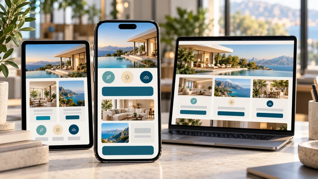
People move through the internet quickly, especially on their phones. A potential customer may discover a business while waiting for coffee, comparing services from the sofa, or checking options during a lunch break. In those moments, the website has only a short time to feel useful and trustworthy. That is why companies investing in website design in New Jersey need to think beyond how a site looks on a desktop monitor. Mobile visitors expect pages to load smoothly, menus to make sense, text to be readable, and forms to work without frustration. When those basics are handled well, a website feels polished and easy to use. When they are not, even a strong business can lose attention before a visitor reaches out.
Mobile Is Often the First Point of Contact
For many customers, a smartphone is the first place they encounter a business. They may arrive from search, social media, or a recommendation. That first visit can shape how professional the company feels.
A mobile-friendly site adjusts naturally to a smaller screen instead of forcing visitors to zoom or drag just to understand the page. Navigation should remain simple, buttons should be easy to tap, and important information should be easy to find.
The experience does not need to feel flashy. It needs to feel comfortable. When visitors can move through a site without thinking about how it works, they can focus on the services or products they came to see.
Responsive Design Keeps Everything Consistent
Responsive design allows a website to adapt to phones, tablets, laptops, and desktop monitors while keeping the brand and information consistent.
Customers may use more than one device while making a decision. Someone might discover a service on a phone and return later on a laptop. A consistent experience makes that journey feel connected.
Responsive design also prevents common problems such as oversized images, tiny text, or menus that cover important content. Instead of treating mobile as an extra version of the website, flexibility becomes part of the design from the beginning.
Speed Matters More Than Ever
A beautiful website can still disappoint visitors if every page takes too long to appear. Mobile users are often browsing on cellular connections or looking for information quickly. They are unlikely to stay patient when a page feels heavy or sluggish.
Large images, unnecessary scripts, oversized video, and complicated effects can all slow a site down. Good web design considers performance alongside appearance.
Images can be optimized, code streamlined, and unnecessary elements reduced. Speed also supports conversion because visitors can reach service pages, contact information, or inquiry forms without frustrating delays.
Navigation Should Feel Effortless
Desktop websites have room for large menus and numerous navigation options. Mobile screens do not, so structure needs to be more deliberate.
Visitors should understand where to go almost immediately. Service pages, contact details, location information, and key company information should not be buried beneath layers of menus.
For local businesses, someone searching by phone may want an address, opening hours, a number, or an appointment option immediately.
Buttons should be large enough to tap comfortably, links should have adequate space between them, and menus should not demand precision. Good mobile navigation respects the way people actually use their phones.
Forms Should Not Feel Like Work
Contact forms, quote requests, booking forms, and checkout pages can become major obstacles when designed primarily for desktops.
Tiny fields, excessive questions, awkward dropdown menus, and buttons hidden by the keyboard can make a simple task irritating. Every extra difficulty gives a visitor another reason to stop.
Mobile-friendly forms should be concise and easy to complete. Fields need comfortable spacing, labels should remain clear, and the appropriate keyboard should appear for phone numbers or email addresses.
An initial inquiry rarely needs a long questionnaire. Making first contact easy can encourage more visitors to take that step.
Readable Content Builds Confidence
A website should never make people work to read it. Small fonts, long blocks of text, weak spacing, or poor contrast become even more noticeable on a phone.
Mobile content benefits from clear headings, manageable paragraphs, comfortable line spacing, and a visual hierarchy that helps visitors scan. Most people will look for the sections that answer their immediate questions.
That does not mean content needs to be shallow. Useful detail still matters, but it should feel approachable.
Good readability also supports credibility. A thoughtfully organized site suggests that the business pays attention to details, which can influence how customers view the services behind the screen.
Calls to Action Need to Be Obvious
A business website usually has a purpose beyond providing information. Visitors may be encouraged to call, request a quote, schedule a consultation, visit a location, or make a purchase.
On mobile, those next steps should be easy to find. Phone numbers can be tappable, contact buttons accessible, and calls to action placed naturally throughout longer pages.
The wording matters too. Visitors should understand what happens after they tap. “Request a Quote” or “Schedule a Consultation” is clearer than vague wording that leaves the next step uncertain.
Strong calls to action do not need to feel aggressive. At sensible moments, they simply make the website easier to use.
Mobile Design Supports a Professional Brand
Customers often make quick judgments online. A dated or awkward mobile site can create the impression that a business has not kept up, even when its actual service is excellent.
A polished mobile experience sends a different message. It shows attention to convenience, presentation, and the way modern customers search for information.
That consistency should extend to photography, typography, colors, and tone. The mobile version should still feel like the same business, not a stripped-down afterthought.
Customers may compare several providers within minutes, and a site that feels easier to use can leave a stronger impression.
A Better Mobile Experience Supports Growth
Mobile-friendly design is no longer a minor technical upgrade. It influences how customers discover a company, understand its services, and decide whether taking the next step feels worthwhile.
Responsive layouts, faster pages, readable content, simple navigation, practical forms, and clear calls to action all work together. The best mobile experiences often feel natural because nothing gets in the visitor’s way.
For a business, that can mean more than a nicer-looking website. It can lead to fewer abandoned visits, more inquiries, and a digital presence that reflects the quality of the company itself. When a site works comfortably wherever customers happen to find it, the website becomes a useful business tool rather than just an online brochure.

Sandra Larson is a writer with the personal blog at ElizabethanAuthor and an academic coach for students. Her main sphere of professional interest is the connection between AI and modern study techniques. Sandra believes that digital tools are a way to a better future in the education system.