From SaaS startups to e-commerce giants, digital teams spend countless hours perfecting landing page design. However, despite the efforts, many modern landing pages look similar. A large hero image, a short headline, a series of trust logos, one bold call to action. All this gives me a feeling of deja vu.
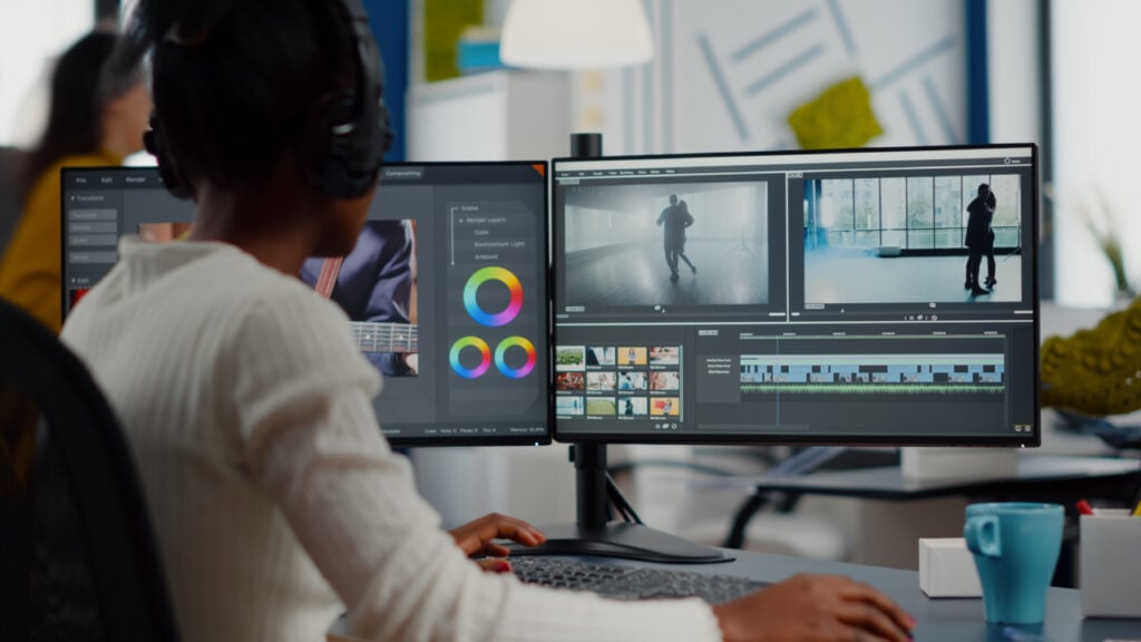
What if we looked at landing page design not as a static layout challenge, but as a dynamic storytelling sequence—more like a scene in a film than a flyer on a wall? Film editing is an area where the UX discipline can learn a lot.
Using tools like Pageflows, which aggregates videos of real user experiences of the best products, designers can observe how subtle movement, timing, and flow shape the user experience.
Let’s explore what UX can learn from the language of cinema—and how it might help rescue landing page design from predictability.
The Landing Page as a Scene, Not a Screenshot
Traditional landing page design often assumes that users take in a page as a single, holistic view. But the truth is, users scroll, skim, click, and interact in nonlinear ways. Their journey through the page is more like a camera tracking a character through a room than a billboard flash.
Film editors control pacing, reveal information in layers, and guide emotion through rhythm. UX designers can do the same—if they start thinking of landing pages as sequences, not snapshots.
Pageflows provides a unique opportunity to analyze this in action. Rather than static screenshots, it records how users interact with real landing pages across industries. Watching a flow from start to finish reveals not just what content appears, but when and why it works (or doesn’t). It’s like watching the director’s cut of UX.
Pacing, Friction, and Emotional Hooks
One of the key techniques in editing is pacing—deciding how long a shot lingers before cutting to the next. In UX, this translates to how long users spend on a section before scrolling, or whether microinteractions subtly delay or accelerate the flow.
When designers use Pageflows to reverse-engineer landing page design, they can spot where pacing breaks down. Is the form too early? Is the value proposition buried under generic fluff? Does the CTA appear before trust has been built?
Moreover, just like a well-timed music cue or close-up can elevate a scene, landing pages benefit from emotional hooks—things like testimonial videos, user stats, or visual metaphors that make the message stick. Pageflows highlights these moments, showing how top-performing sites use them strategically rather than as filler.
Cutting Through Clutter with UX “Montage”
The montage—a series of quick cuts that compress time or deliver a lot of information fast—is one of film’s most powerful tools. UX can mirror this through concise storytelling and layered content.
Instead of overwhelming users with walls of text or endless carousels, effective landing page design compresses and prioritizes. It guides users from awareness to action with just the right amount of visual and narrative momentum.
By watching curated flows on Pageflows, designers can observe how products use micro-montages: animated stats, scroll-triggered reveals, progressive disclosure. These techniques help users process complexity without fatigue. It’s not about flashy animation—it’s about narrative clarity through movement.
Beyond Templates: Editing the Editor in Your Head
One of the biggest issues with today’s landing page design culture is the prevalence of templates. While helpful for efficiency, they often encourage surface-level tweaks rather than fundamental storytelling changes.
Film editors ask themselves: what should the audience feel right now? UX designers should ask the same thing, especially when creating landing pages. What should the user feel when they click the call to action button? What emotions: calm, inspiration, curiosity?
Pageflows doesn’t give you a drag-and-drop editor. It gives you context. By watching dozens of real user flows, you develop an internal editor—an instinct for pacing, engagement, and friction. That’s not something a wireframe can teach. It’s something you learn by watching the cuts.
Conclusion: Reframing the Landing Page as a Cinematic Experience
In a web filled with near-identical layouts, it’s not the tools or the templates that will set your landing page apart—it’s the narrative choices. Designers who think like editors understand that a page isn’t just content—it’s choreography.
Pageflows serves as a kind of archive for this choreography, showing how companies structure, surprise, and sequence their messaging. Not to copy—but to decode.
The next time you’re designing a landing page, step away from the grid for a moment. Watch how great flows unfold. Ask yourself what your user should feel—frame by frame, click by click. Because the future of landing page design isn’t in sharper corners or bigger buttons.
It’s in better stories.
Caroline is doing her graduation in IT from the University of South California but keens to work as a freelance blogger. She loves to write on the latest information about IoT, technology, and business. She has innovative ideas and shares her experience with her readers.


