
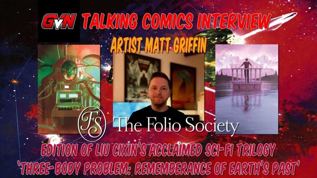
Few science‑fiction works demand as much visual imagination as Liu Cixin’s Remembrance of Earth’s Past. A trilogy that bends physics, philosophy, and human perspective into something vast and unsettling. For The Folio Society’s special edition, award‑winning artist Matt Griffin steps into that cosmic space with a body of artwork that feels both mythic and meticulously grounded. Griffin creates imagery that captures the trilogy’s awe, terror, and impossible scale while remaining deeply human at its core.
As with most Folio Society special editions, Griffin’s illustrations don’t merely accompany the text; they interpret it. His stark compositions, atmospheric palettes, and razor‑precise silhouettes give shape to concepts that have challenged readers for years. Moving from the quiet dread of first contact to the grandeur of multi‑dimensional civilizations. This edition marks a rare fusion of literary ambition and artistic vision.
We recently caught up with Griffin to explore how he approached one of the most formidable worlds in modern science fiction. His challenge: to translate its physics-defying ideas into visual storytelling and to contribute to a landmark release by the Folio Society (no pressure there). So let’s welcome artist Matt Griffin to GVN Talking Comics.
Creative Beginnings
GVN: Thank you for sharing a bit of your day, Matt. Before we discuss your contributions to Liu Cixin’s trilogy “Three-Body Problem: Remembrance of Earth’s Past” for The Folio Society, I would like to explore your creative beginnings. You are an internationally recognized, award-winning Irish artist, author, and storyteller. When did you first become interested in art, and whose work inspired your passion for this medium?
MG: My pleasure! I have been drawing and making up stories for as long as I can remember. I’ve also been obsessively consuming them for just as long. And so my interest & passion for art and stories has always been with me.
As for inspiration, there has of course been so much. But I think I can pin-point two major influences – one was The Hobbit, and Tolkien’s own illustrations. That told me I could build worlds and show them in words and images. The other was Dune, a little later, which expanded what building a world could be.
Bringing Liu Cixin’s Visions to the Reader
GVN: So, let’s move right into this exciting new Folio Society book. Liu Cixin’s trilogy is known for its vast scale and mind-bending concepts. What was your process as you began translating such enormous, abstract ideas into a visual language that feels grounded, cohesive, and true to the novels?
MG: I am of course an avid reader. But when I read for a project like this, it’s a little different to my regular bedtime book. It’s quite meditative, while also being very intensive! I try to understand the flow of the story as deeply as I can. I take huge amounts of notes via post-its stuck to the top of the pages, highlighted lines, marked passages and scribbled thumbnails in a notebook.
I don’t want my images to just describe bits of the story, I think they should aid that flow. Of course, sometimes the image is just something from the story that makes a good visual! But I try to also show moments I believe are important to the overall picture, that propel the experience for the reader. Or… just sometimes is a cool image 😀
Working with the Folio Society
GVN: The Folio Society is renowned for its craftsmanship and attention to detail. What was your collaborative process like with their editorial and design teams as you shaped this limited edition?
MG: Working on a Folio Society book is very much a collaborative process. The production has equal billing to the artwork, if not the story. So we work together to decide on how that combination can make the edition really sing. We’ll talk through bindings, box material, how they could open etc. On Three-Body we really tried to push the luxury. So that was materials, yes. But from my point of view, the use of actual simulations to create some of the designs was something I wanted to do to make it a little special .
Choosing Which Story Points to Illustrate
GVN: With so many iconic moments across the trilogy, how did you decide which scenes or concepts demanded illustration, and what guided your choices in balancing spectacle with subtlety?
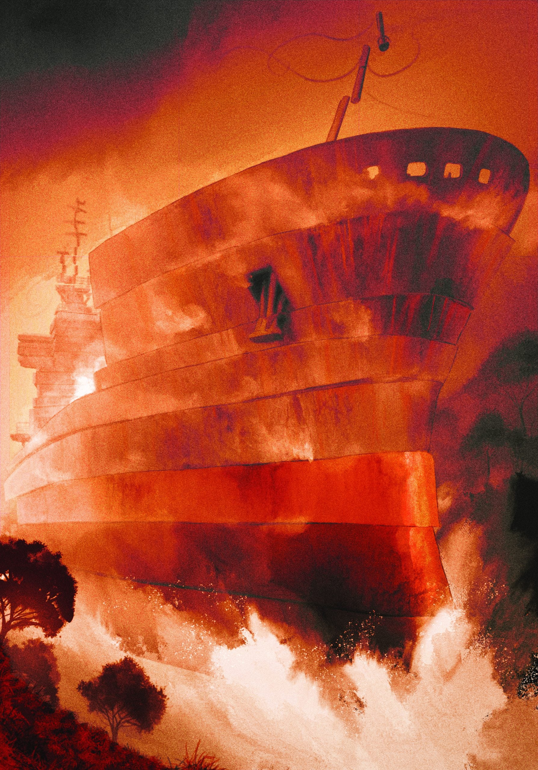
MG: It’s really a combination. Certain scenes are obviously visually arresting in how they are written. Some are so unique to the story that you just have to show them. And as mentioned, I like to try and choose images or concepts that become part of the flow of the story. After that, it’s a process of a little compromising, because you can’t show it all! You have to space them out.
I make a long list, and together with Folio Society we whittle that down to what we both believe are the best choices.
The Visual Challenges
GVN: The series blends hard science, existential dread, and cosmic wonder. How did you approach the challenge of visually merging scientific precision with emotional atmosphere?
MG: Well for me, atmosphere comes first. That’s what I strive for in my work. It sounds very cheesy, but I don’t want to show the reader what something looks like as much as I want to show them, somehow, with colour and texture, what it feels like. At least – that’s the aim!
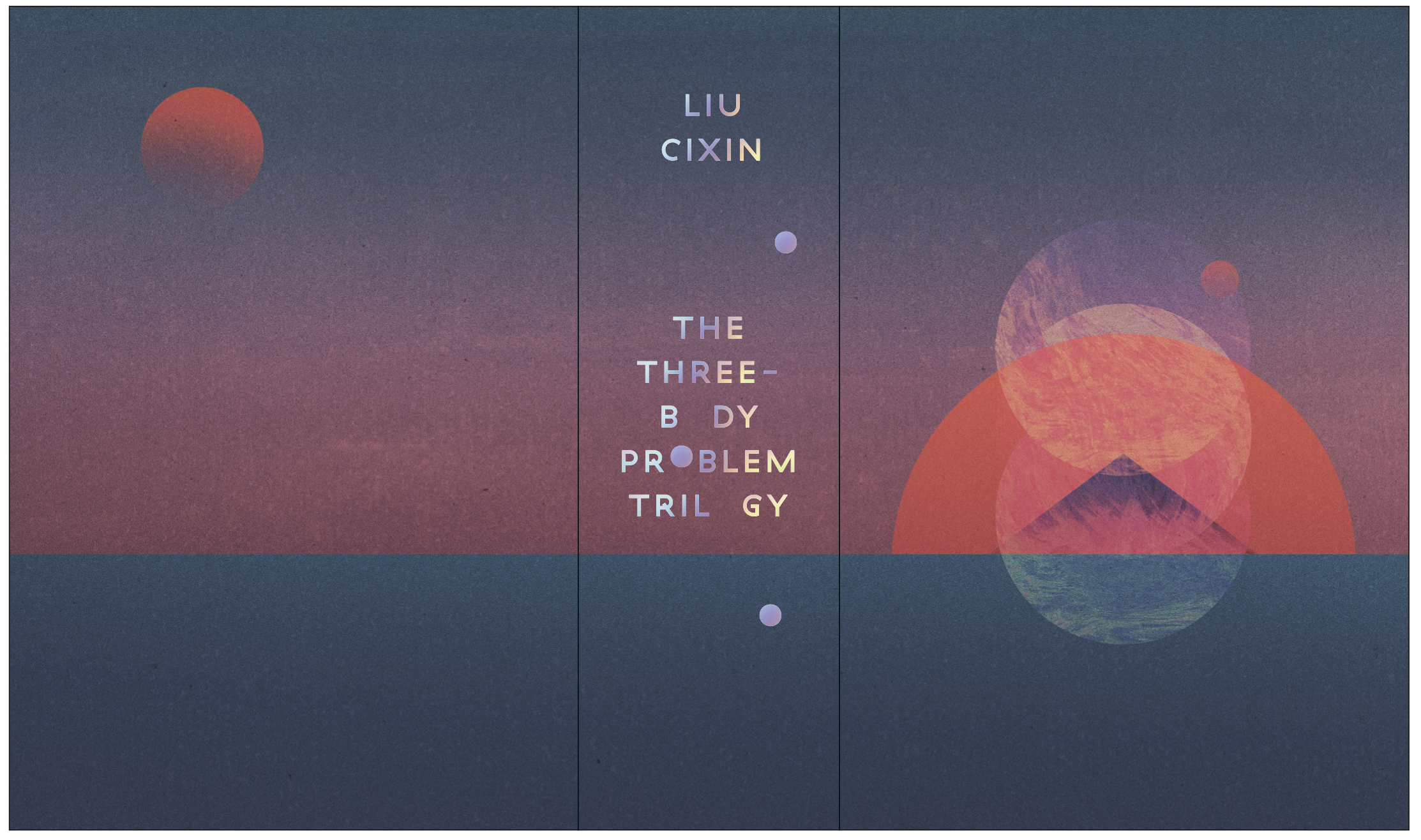
But for this book, with science so infused with the story, I wanted to do something to honour that. The idea I had was to represent orbital paths of the three celestial bodies (and the planet caught in them) accurately. To use some kind of physics modelling to show what the paths would look like with actual mass and gravity involved.
So, after much failed experimentation in Blender, I eventually found someone, purely by chance (the only time a social media algorithm has worked!) who had written code to visualise three-body problem solutions.
It’s a chaotic maths problem – there is no one solution. Lots of them have been discovered (despite it being notoriously difficult), and the code allows you to input those values and it visualises the result. Some of them are very beautiful and orderly, some are like insane scribbles – but all are accurate. I was also able to experiment with my own values, but of course – most of them didn’t work!
I could then export the results to vector graphics and now the design on the limited edition box is the result of real physics.
Material Restraints
GVN: Limited editions come with unique physical constraints — paper texture, color limitations, binding considerations. How (if at all) did the format shape your artistic decisions for this project?
MG: Well with Folio Society you know the end result is going to be beautiful. They only use the best materials. Making art for print means colour is always a consideration – you can’t have the same colours on paper as you have on a screen (CMYK v RGB for the technical-minded!).
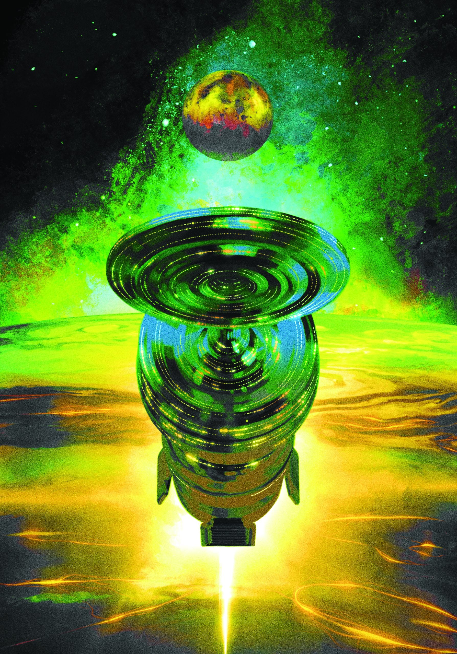
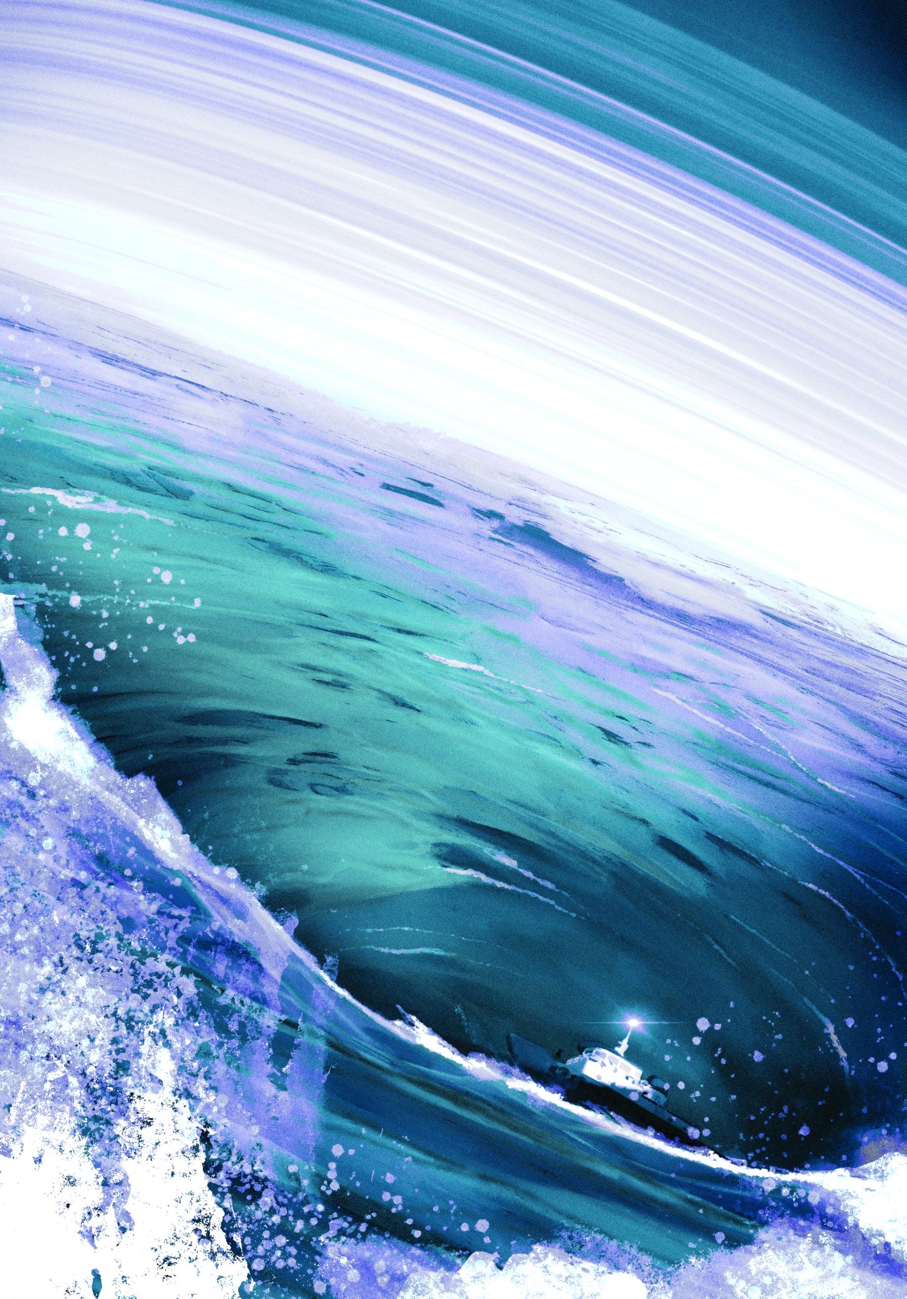
But a good example of material constraints would be the illustration of the 4-Dimensional bubble.
Liu Cixin explicitly says that four dimensions cannot be described. So of course my first thought was – I have to try and illustrate that!
Initially we discussed all kinds of ideas. Using holographic printing, like we used to get on old stickers in the 80s. Using a new kind of 3D-ink-printing method that looks normal until you put on special glasses (which would come with the book) and then it’s 3D. Lenticular printing, so when you moved the book the image would move and warp.
In the end the problem came down to these ideas being cool, but over-all negatively affecting the experience of the book. Holographic and lenticular would result in one extra-thick page, and including glasses that could get broken or lost could just be annoying for collectors.
A similar thing happened with the box. My initial idea was to have it locked, and only opened by solving a puzzle! But we (correctly) reasoned that people would just get annoyed 😀
So it’s not a case of limitation on materials as much as judging whether something adds or takes away from the pleasure of owning and reading the book.
The Reader’s Experience
GVN: Thank you so much for chatting with us today, Matt. Finally, what do you hope readers experience when encountering your illustrations alongside the text? How do you see your work contributing to the long-term legacy of Remembrance of Earth’s Past?
MG: I hope that they don’t find my illustrations a distraction. They should very much feel part of the story, part of the flow. I hope they add to the atmosphere you sense while reading, and they don’t conflict with what the reader is imagining themselves. I won’t always get that right! But I’ll try.
It’s such an incredible honour to have even the tiniest part in the legacy of these amazing books. I hope I have done them justice.
What Matt Griffin brings to Liu Cixin’s Remembrance of Earth’s Past is more than illustration — it’s realization. His work in The Folio Society edition doesn’t simply visualize the trilogy’s impossible physics or cosmic dread; it translates them into imagery that feels mythic, intimate, and profoundly human. Our chat with Matt reveals just how much intention sits behind every composition, every color choice, every moment where the unimaginable becomes tangible on the page.
As with every Folio Society release, this special edition stands as a testament to what happens when a visionary artist meets a visionary text. Griffin’s contributions elevate the reading experience, offering a visual language that deepens the trilogy’s emotional weight and conceptual scale. As fans discover this edition, they’ll find not just stunning artwork, but a companion to Liu Cixin’s ideas — one that respects their complexity while making them newly accessible.
If you are interested in this genre, The Folio Society offers many excellent editions. Works from great authors like Margaret Atwood’s The Handmaid’s Tale, Malorie Blackman’s Noughts and Crosses, Octavia Butler’s Kindred, Frank Herbert’s iconic Dune, Kazuo Ishiguro’s The Buried Giant, Cormac McCarthy’s The Road, Haruki Murakami’s The Wind Up Bird Chronicles, and Kurt Vonnegut’s Cat’s Cradle. You can find these and many others at The Folio Society’s website.

Senior Writer at GeekVibesNation – I am a 60 something child of the 70’s who admits to being a Star Trek/Star Wars/Comic Book junkie who once dove headfirst over a cliff (Ok, it was a small hill) to try to rescue his Fantastic Four comic from a watery grave. I am married to a lovely woman who is as crazy as I am and the proud parent of a 21-year-old young man with autism. My wife and son are my real heroes.