
A poster can look polished at full size and still fail the moment it reaches a phone. The face survives, but the billing block becomes unreadable. A logo lands under a platform button. The crop cuts through the only prop that explains the story. That is the useful standard for judging OtterMind: not whether it can make an attractive first image, but whether an editor can turn one direction into several publishable assets without rebuilding the idea each time.
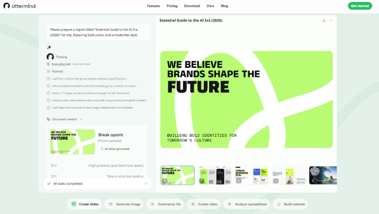
Ottermind starts from a text description and can also use reference images, product notes, and brand context. Its image workflow lets a user keep changing text, logo placement, background, color, composition, and local details after generation. For an entertainment desk, that editing path matters more than a fast surprise. The real work begins when the same visual must become a review header, a vertical story card, and a square social tile while the title treatment and cast identity stay recognizable.
The First Draft Is The Least Useful Test
A beautiful first draft proves very little because entertainment graphics rarely travel alone. The art moves through a content-management header, an email card, a social scheduler, and sometimes a partner package. Each destination adds a different crop, safe area, and text size. Designers usually discover the expensive problems after the image leaves the wide canvas: a release date melts into a bright costume, a small studio mark becomes unreadable, or a character at the edge disappears in the vertical version.
The review should therefore begin with three hostile but ordinary placements. These are not synthetic benchmark tricks. They are the places where editorial rework actually appears:
-
A wide article header that needs a clean title area and room for the site crop.
-
A square tile where the central face and one clear idea must survive without tiny copy.
-
A vertical card where the billing strip, release date, or episode label cannot sit under interface controls.
If a visual only works as the original landscape image, it is a concept frame, not a kit. A production-ready direction should make the editor’s next decision easier. It should show where copy can move, which background area can be simplified, and which details must remain untouched. That turns the first draft into source material instead of a fragile final.
Prepare The Brief Around Real Crops And Credits
The prompt should describe the finished publishing job, not just the mood. “Dark science-fiction poster” leaves too many decisions open. A better brief names the subject, the emotional temperature, the dominant colors, the required empty area, and the formats that follow. It also says what must remain legible, such as a title, a release date, or a short review label. Reference images help when a costume, product, or existing campaign palette must stay close to an approved direction.
Describe Subject Mood Format And Empty Space
Start with the subject and action, then name where the copy belongs. An editor might ask for a single character on the right, a quieter left side for a headline, and enough contrast behind a two-line title. That is more useful than piling on style adjectives. It gives the generator a layout problem it can solve and gives the reviewer a visible pass condition.
Add the destination early. A cinema-style key art image may tolerate dense detail. A mobile story card cannot. If the set needs both, ask for a master composition with breathing room rather than two unrelated pictures. Ottermind can carry the same project context into later revisions, so the original direction does not have to be retold from zero.
Choose A Style That Survives The Franchise
The image page supports realistic, illustration, 3D, poster, and other styles. The useful choice is the one that fits the property and can repeat across the set. A watercolor treatment may work for a reflective interview card but fight a hard-edged action review. A realistic poster may suit a product feature yet create extra scrutiny around faces, hands, and logos.
Keep the style decision tied to what the desk can approve. If a publication has a restrained house look, a loud cinematic render creates more work even when it looks impressive. The editor then spends an afternoon stripping away effects, repairing contrast, and moving type. A simpler direction with consistent palette and clear negative space often clears editorial faster.

Refine Text Logos Background And Local Details
Generate after the scene and style are clear, then fix the smallest visible failure. The editing path can target text, logo placement, background, colors, composition, and local details. That means a weak corner should not force a complete restart. If the title area is too busy, simplify that area. If the logo sits too close to an edge, move it. If one prop bends into the costume, correct the local detail while keeping the approved balance.
This is where OtterMind ai earns a place in a real visual workflow. Its value comes from keeping the same direction available for refinement, even though every image will not arrive perfect. Rebuilding from a blank prompt can change the face, lighting, palette, and camera distance together. Local correction limits the blast radius of a small problem.
Generate Once Then Fix The Smallest Visible Failure
A good correction order protects the expensive decisions. First preserve the subject and composition. Next repair the area that blocks publication. Only then polish decoration. Editors often reverse that order because color and texture are enjoyable to adjust. Meanwhile the release date remains unreadable at feed size or the logo still collides with a crop.
Consider a character poster with a bright practical light behind the shoulder. At full size the glow feels dramatic. In the square crop it washes over the episode title. The useful move is not another full generation with a longer prompt. Reduce brightness behind the text, keep the character placement, and check the square again. One controlled change produces a clear before-and-after judgment.
The same rule applies to reference material. A brand asset can clarify palette, logo shape, or product detail, but it should not become permission to invent a new claim or alter a recognizable identity. A warped face, a second unwanted badge, or changed costume lettering would never clear editorial review. Kill that output early. Do not let decorative quality hide a factual or identity error.
Ottermind is especially useful when the editor needs related assets rather than a single lucky image. Keep the approved background treatment, reuse the visual direction, then adapt space and crop for the next format. The kit becomes a sequence of deliberate variations. That is easier to review than a folder of unrelated generations where every frame starts a new argument.
Check The Image Where Fans Will Actually See It
Approval should happen at delivery size. Export or preview the image in the same proportions used by the article template and social scheduler. Zooming into a large canvas rewards detail that may never reach the audience. The mobile crop reveals the opposite: whether the face reads instantly, whether the headline has clean contrast, and whether the smallest required line remains legible.
For the vertical version, place a temporary interface-safe overlay over the top and bottom. The visual does not need to mimic every app. It only needs to prove that the key title and billing information sit away from common controls. For the square version, remove any sentence that only works at poster size. A social tile carrying eight lines of copy has already lost, even if the generator rendered every letter correctly.
The final comparison should use the approved brief, not taste alone. Does the subject remain recognizable? Is the title readable in two seconds? Is the logo present but not dominant? Does the crop preserve the story clue? Can the art move from the feature page to the social queue without another round of emergency retouching? These questions expose the rework bill before publication.
Commercial Assets Still Need A Human Rights Check
Generated campaign art still needs a human review of every source image, model term, brand rule, face, logo, and implied claim. The product supports commercial creative workflows, but that does not transfer rights from an unlicensed reference or make a fictional endorsement safe. Treat the tool as a production workspace, not a substitute for clearance.

Verdict For Editors Shipping More Than One Crop
Ottermind makes the strongest case when a visual must survive revision and travel across formats. A desk that only wants a one-off concept may be satisfied with the first attractive frame. A desk shipping headers, square cards, and vertical promos needs controlled correction much more.
The practical win is modest and valuable: keep the approved direction, fix the smallest visible failure, and judge every asset where the audience will see it. That is how one pop-culture brief becomes a usable kit instead of another folder of almost-finished posters.

Amanda Lancaster is a PR manager who works with 1resumewritingservice. She is also known as a content creator. Amanda has been providing resume writing services since 2014.